The site was in pretty poor shape.
Like a lot of sites, it didn’t see much iteration after launch. And after years of incremental content updates, it had begun to feel like it raised more questions for users than it answered.
One example from our existing product audit.
The first step in our process at Pennebaker was always to evaluate the clients existing site, in order to get a sense of the clients current content structures, usability problems, and potential opportunities.
In Nine’s case that took the form of a document highlighting the sites main barriers to user interaction and wayfinding, as well as some of the content recommendations that we wanted to carry forward into the redesign.
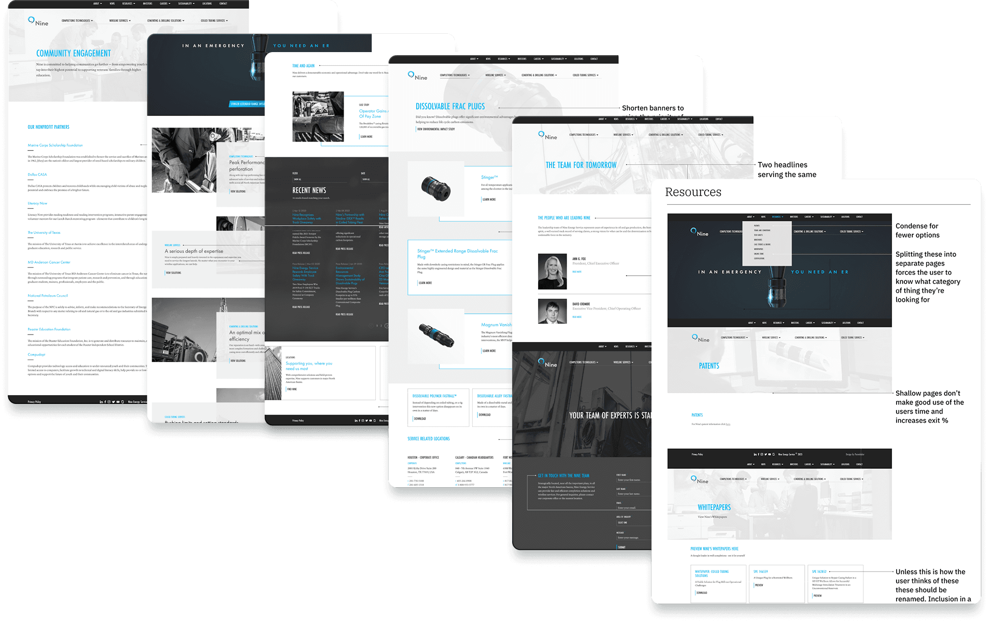
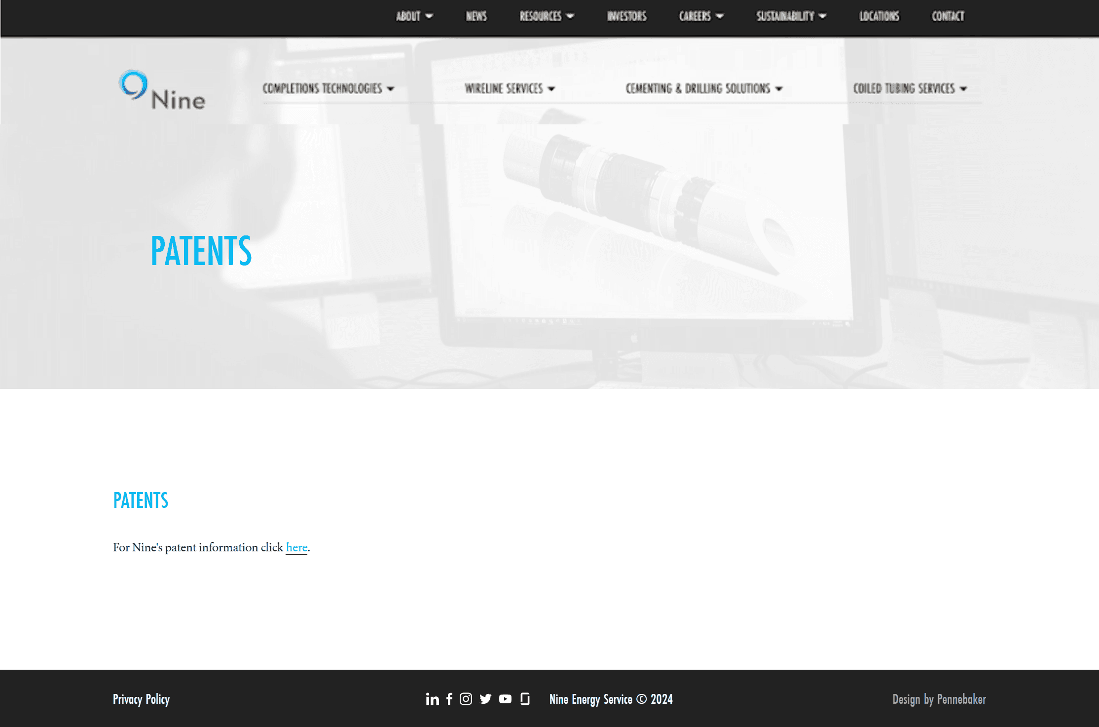
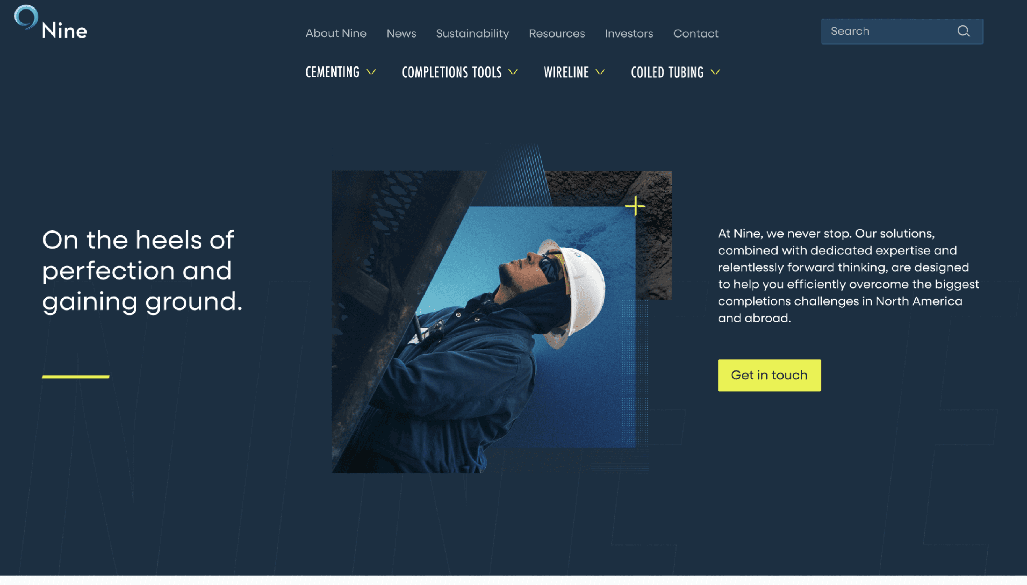
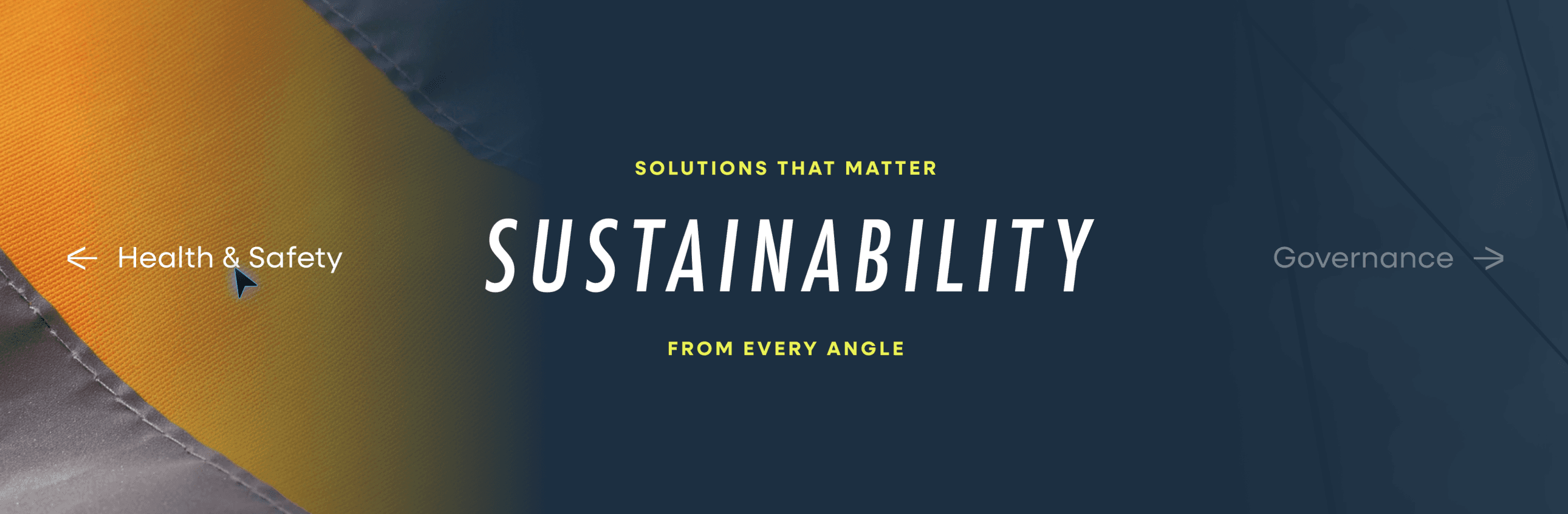
Incremental additions over time had made the sites navigation a bit of a mess. Dead end pages, siloed resources, and very little help understanding the sites hierarchy. However, we did still like how Nine’s four main service lines were given their own space separate from all the other items in the utility nav.
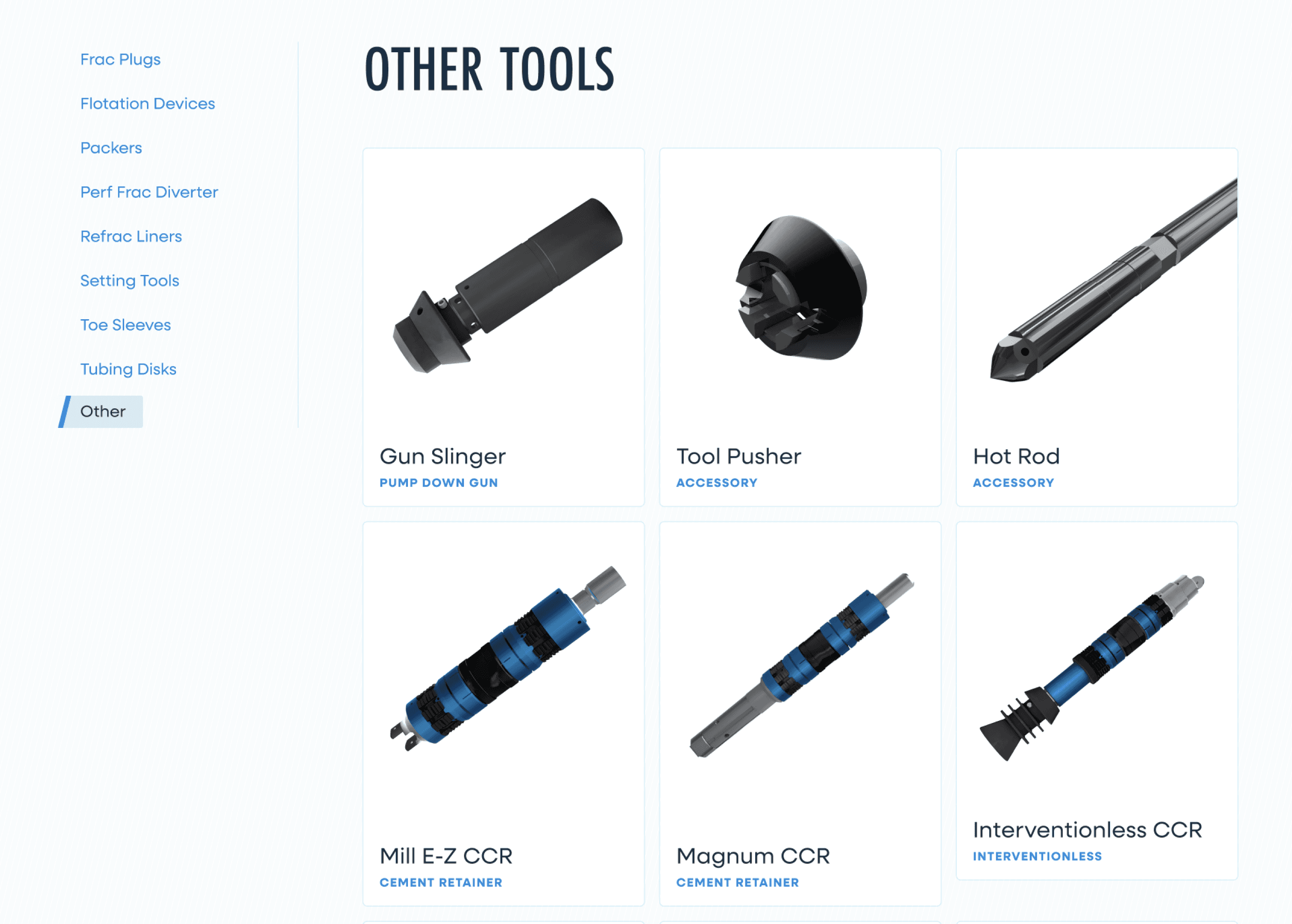
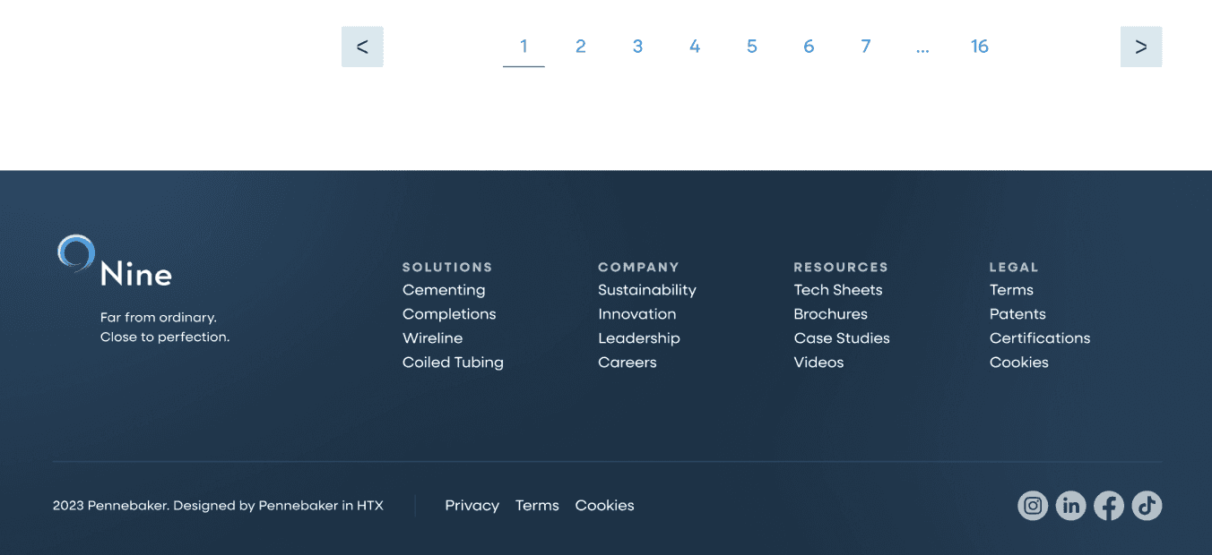
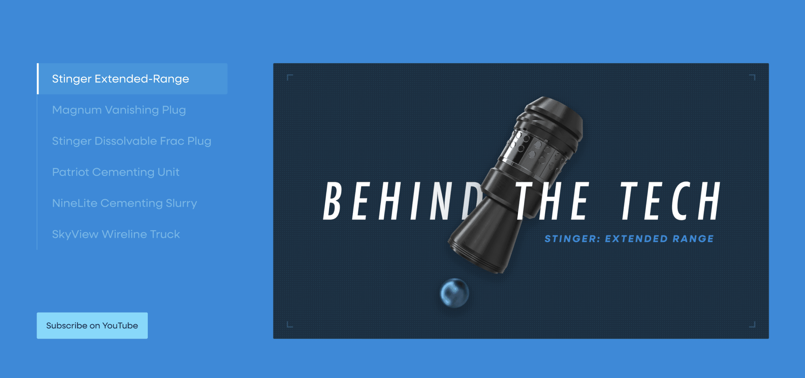
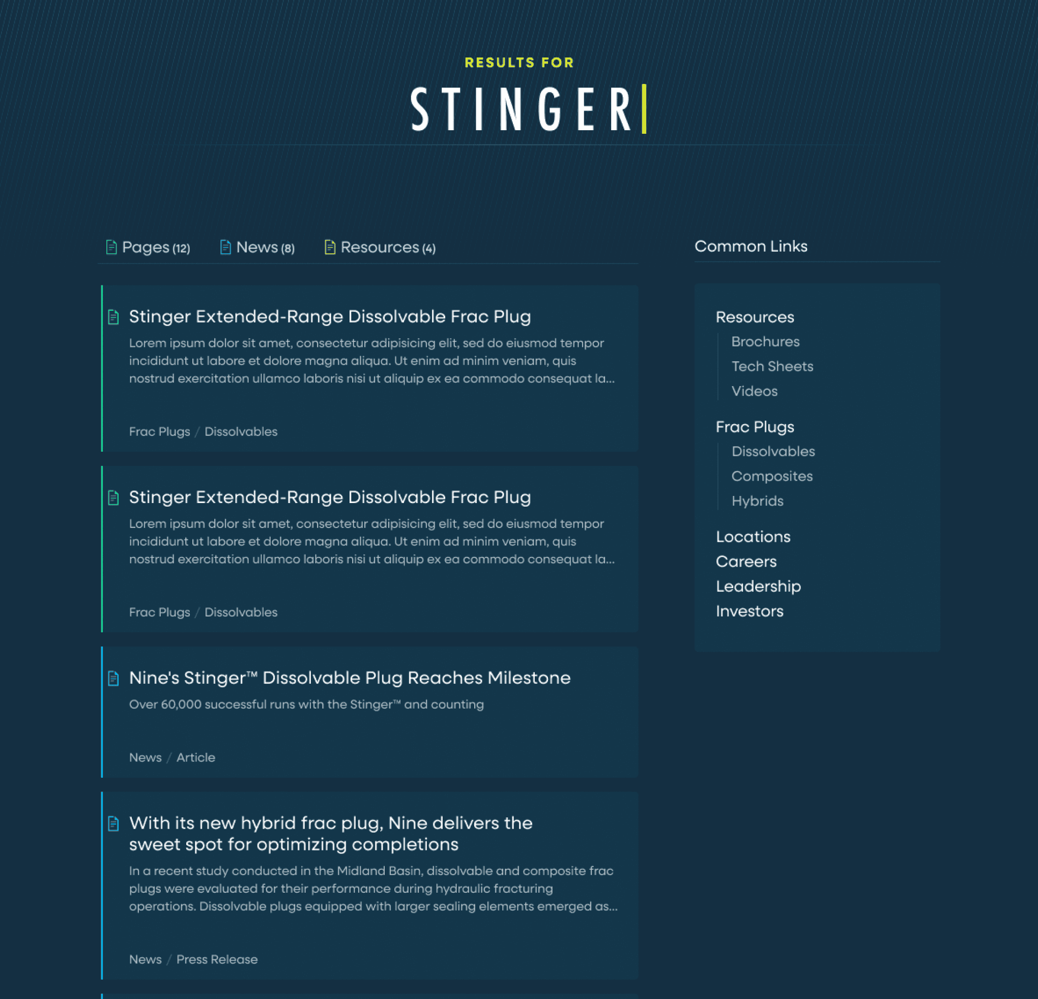
The biggest change and benefit of the new information architecture came in merging all of their tech sheets, videos, brochures, and certifications into one “Resources” page where users could search and filter to find anything they were looking for.
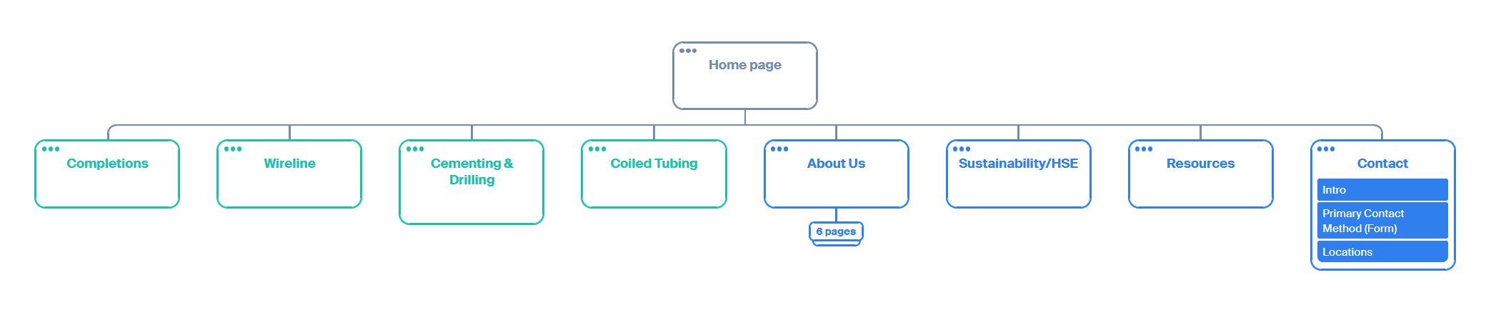
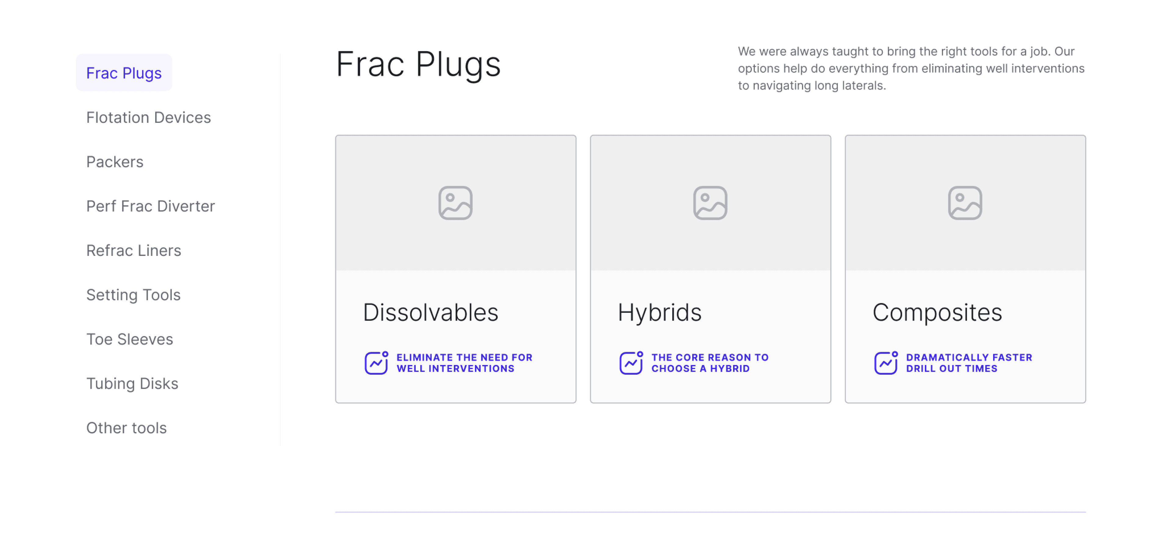
To help users with wayfinding, we focused on adding visible local-navigation for the long service overview pages, anchor links high on product pages to outline what can be found below, and a mega menu that better illustrated how the site is organized.
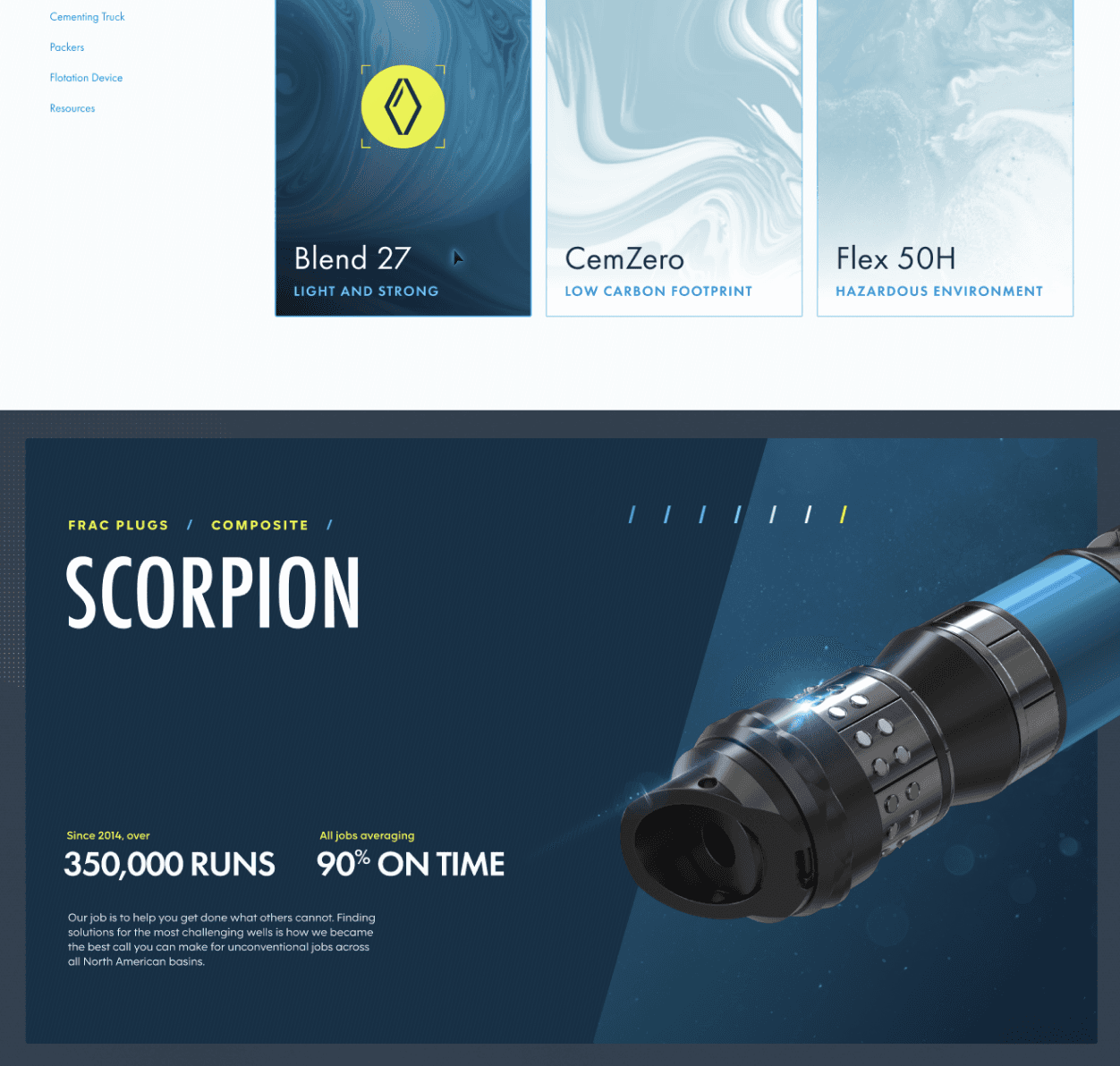
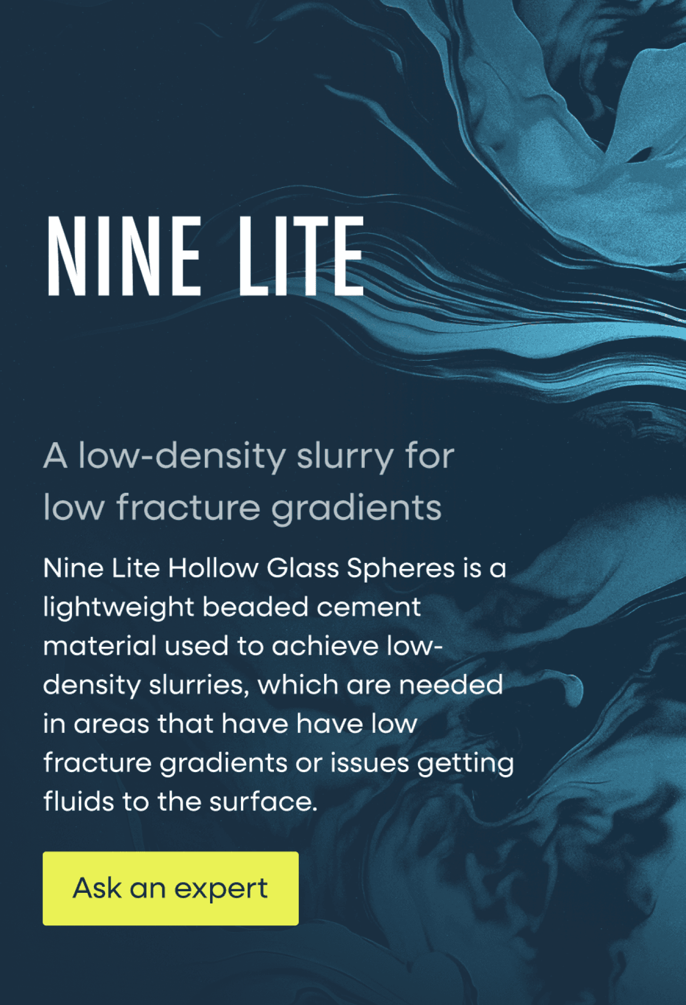
We also made a conscious effort to bring some of the most crucial information on products out of their respective pages, and up to their parents where users would be trying to evaluate what product might be right for them, so they didn’t have to “pogo-stick” into a page and back out again.
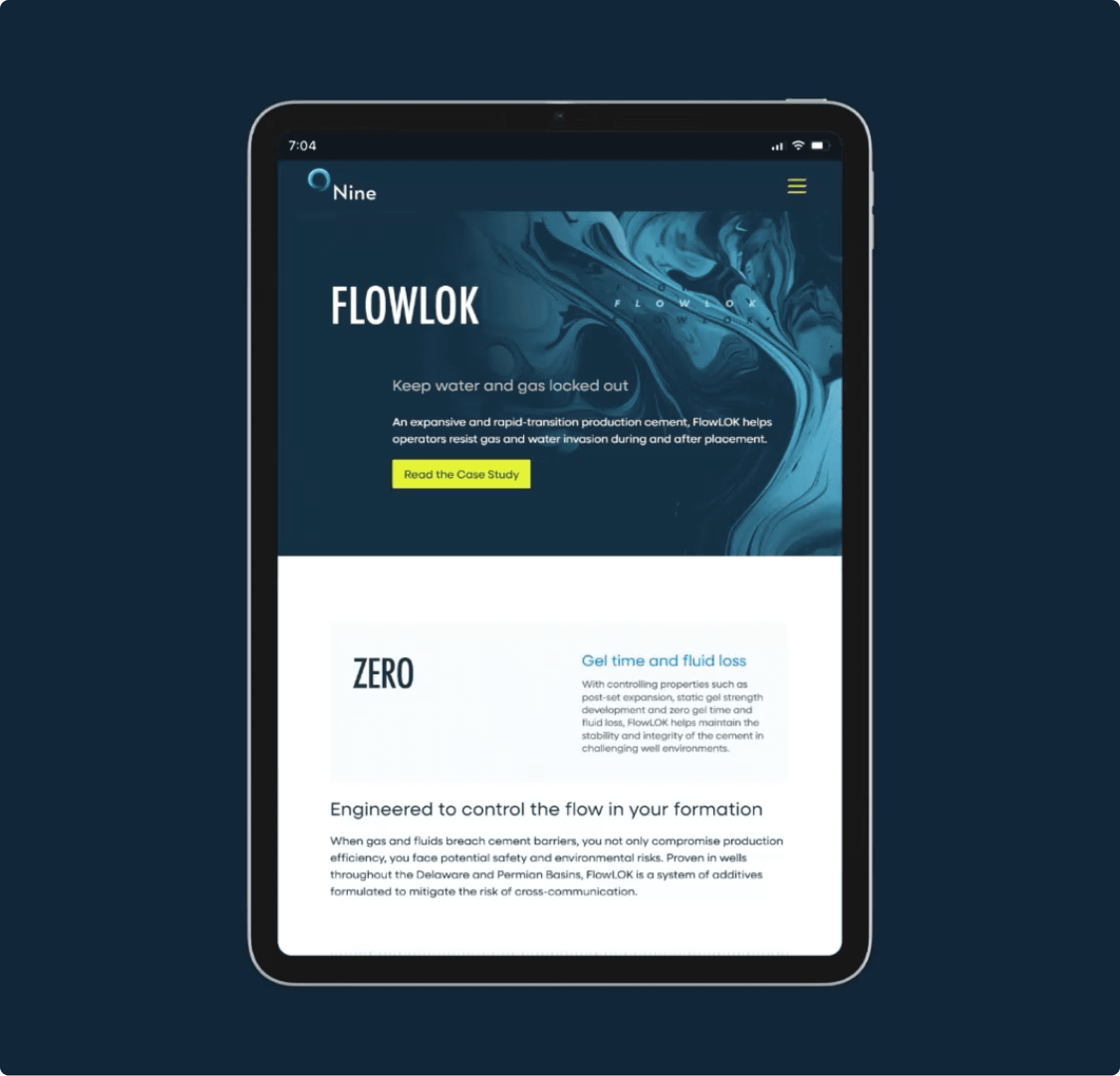
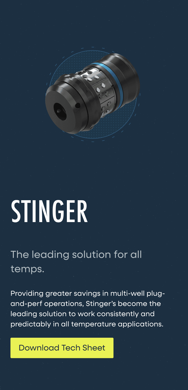
This is best exemplified in the cards for Nine’s cementing slurries, which were given icons and descriptions of their ideal use-case.
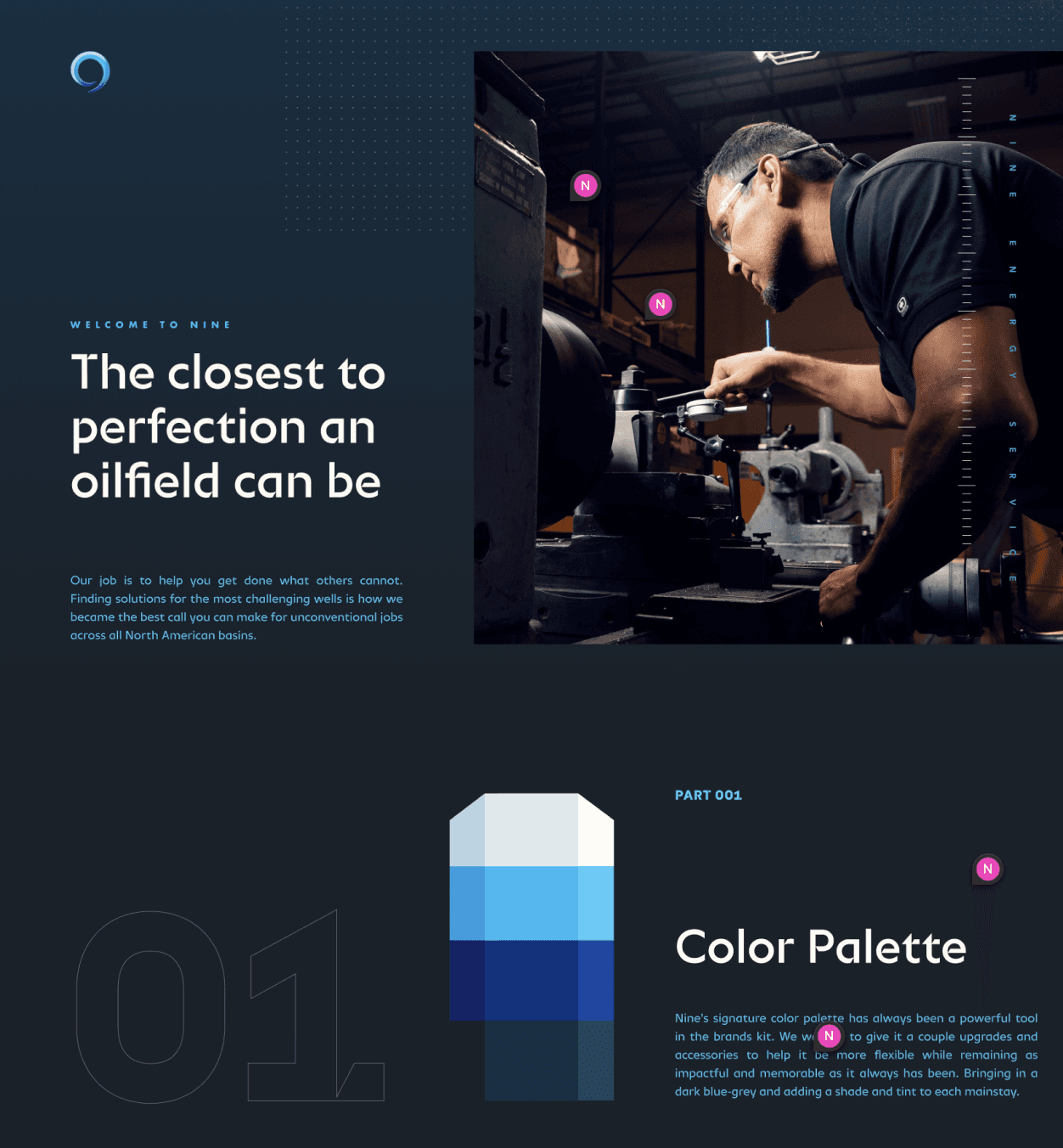
Nine had been a client of Pennebaker for nearly a decade at this point. Starting when Pennebaker helped establish Nine’s initial brand.
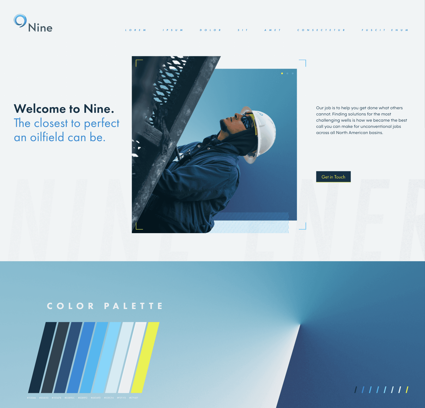
But in updating the site, the brand would also see a facelift. Not an overhaul, or anything that would feel like a departure for the brand, but simply an evolution of the brands look and feel.
I and our creative director each created some initial directions. Over a few rounds we pulled elements of each together into the final direction that would set the style for Nine’s updated site and broader identity.
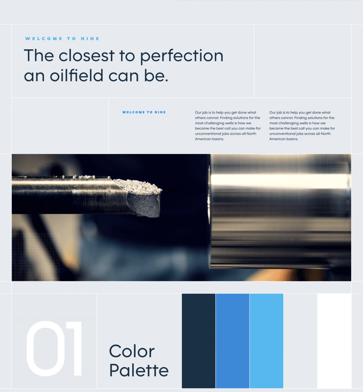
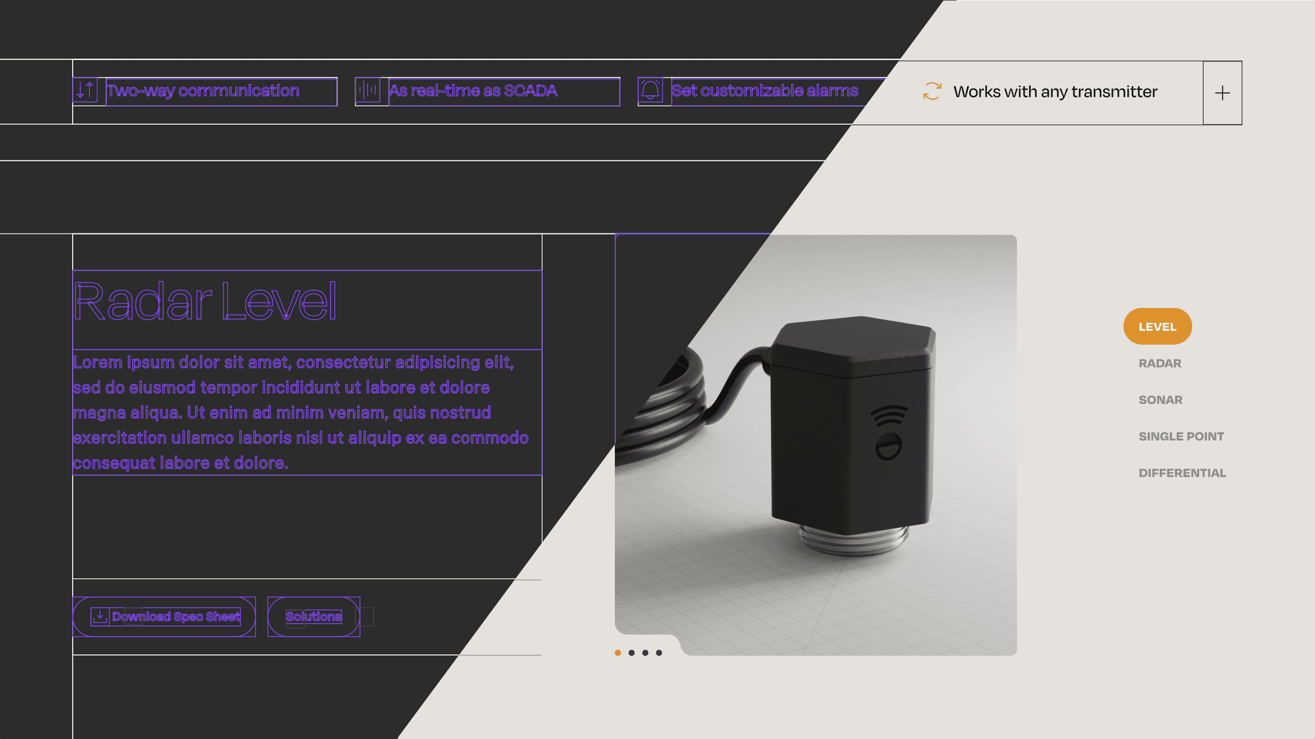
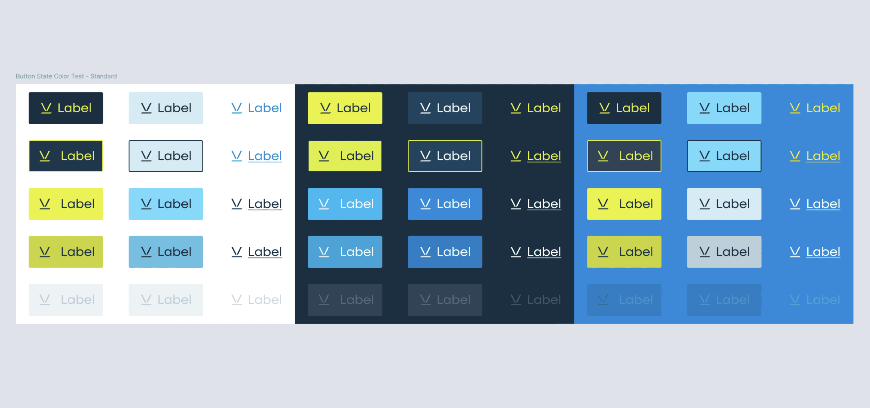
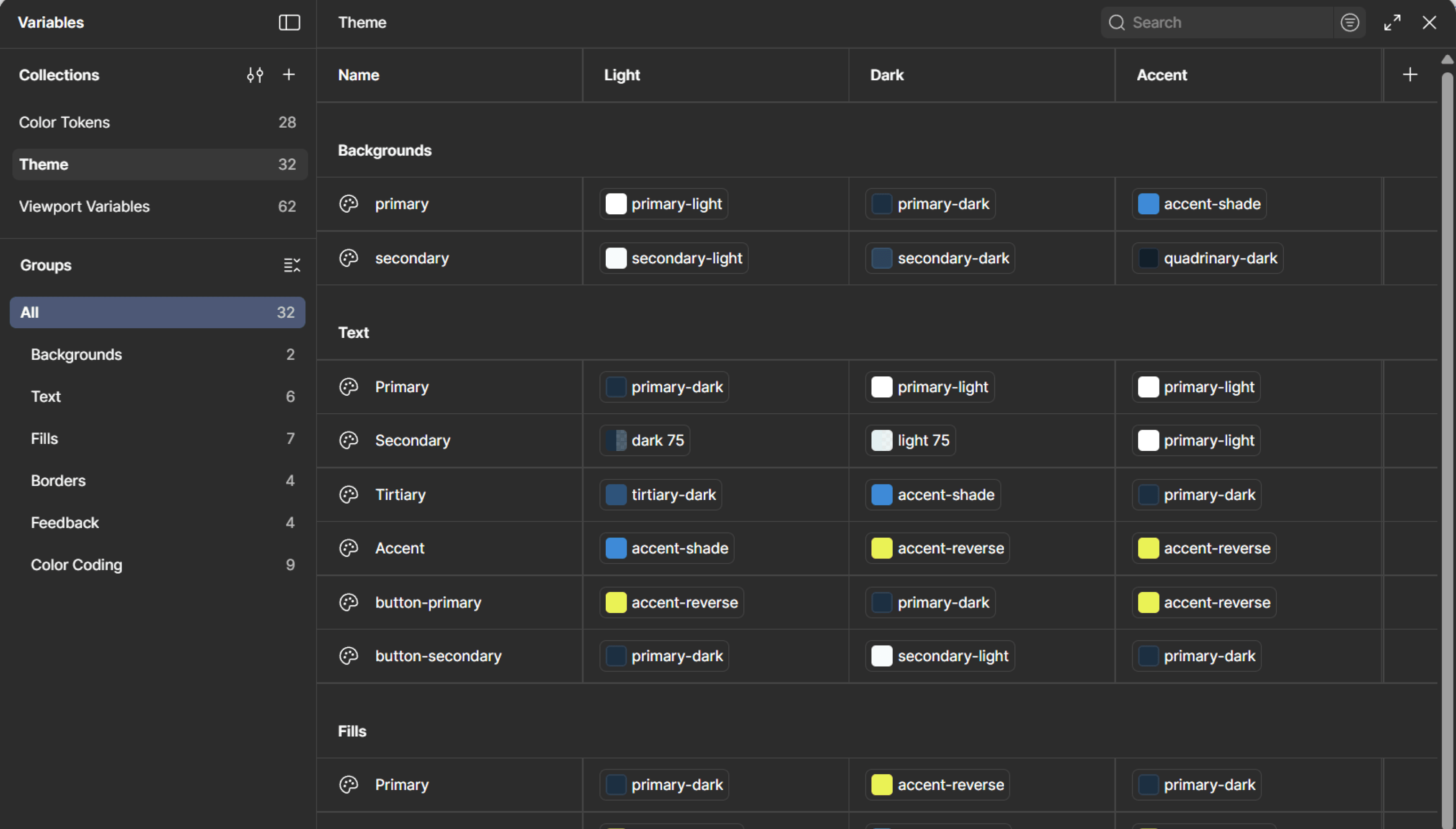
Thanks to the system I created with the dev team over my time at Pennebaker that we called “The Scaffolding”, when we moved into design, we simply duplicated the wireframe file, and already have an intensely robust system to begin the design stage with.
As variables for everything from type to color and spacing get swapped out, the entire design updates and begins to look cohesive in a matter of days. On smaller projects that essentially allows us to get to a pretty good “base model” rather quickly. But for Nine it was just the beginning.
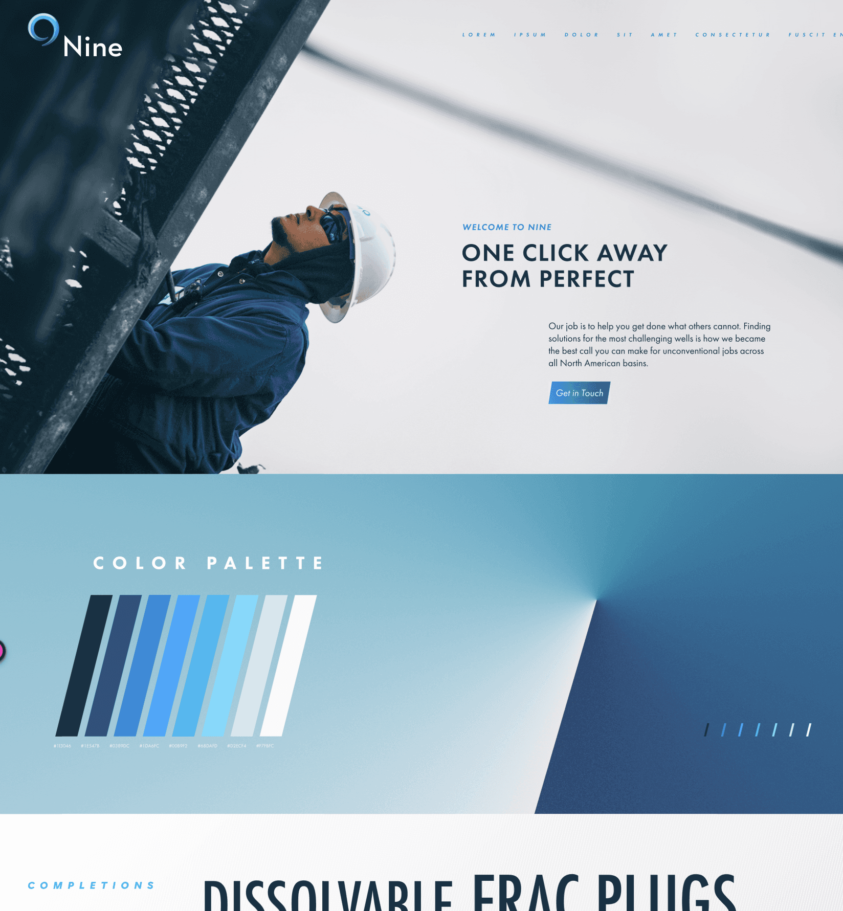
For Nine we developed dozens of unique blocks after the initial system was established, and that’s to say nothing of all the icons, collages, and Rive animations that were eventually created for the site.


let's wrap it up
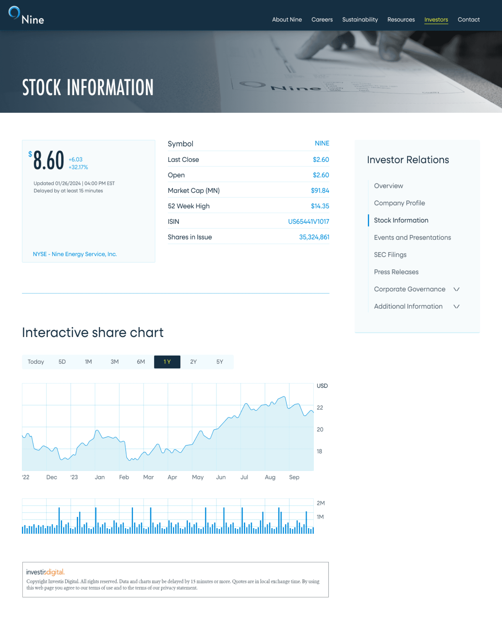
Not only did it look so good that the updated look and feel left the web and spread throughout the rest of the brand. But major problems in the site's user experience were left in the past. All of which we could see in lower bounce rates, longer time on page, more contact requests, and smoother user flows.
Plus, the site was now built on a flexible, scalable foundation. Both in terms of the new design system (built on an early version of our Scaffolding framework) which lived in Figma, but also due to Craft CMS and our developers amazing work.
You can view the site in it's current state at
nineenergyservice.com