The Scaffolding

Work
About
Contact
The job
For years our dev and design teams had a hard time getting along. But over the years I worked with dev to bridge that gap by building a design framework based around the rules of the web.
The Twist
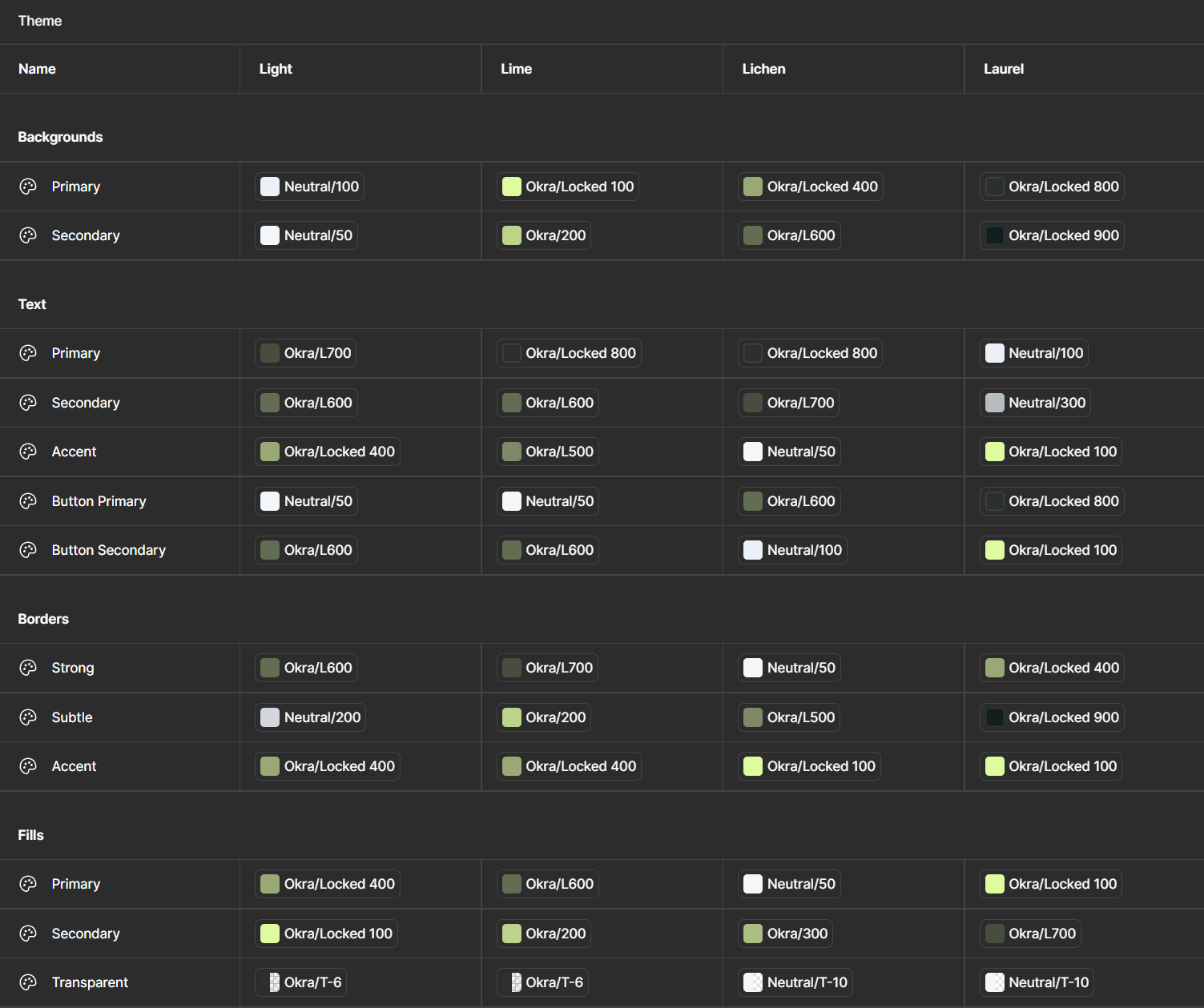
That framework hit lightspeed when Figma introduced variables. All of a sudden every color theme, and every small breakpoint could be systemized. Consistency became automatic.
Inception


The Basic Concepts
Figma Autolayout
Figma Variables
Components
Inception
Everything clicked for me when I realized just how many layouts dev had to code when we designed only with a twelve-col grid.
Seeing 11 layout options in one of our sites’ CMS, (including “5-4”, “4-5”, and “4-5” alt) I realized we needed a new approach. One that started with the layout options, rather than finding the mess we’d made at the end of design.


The job
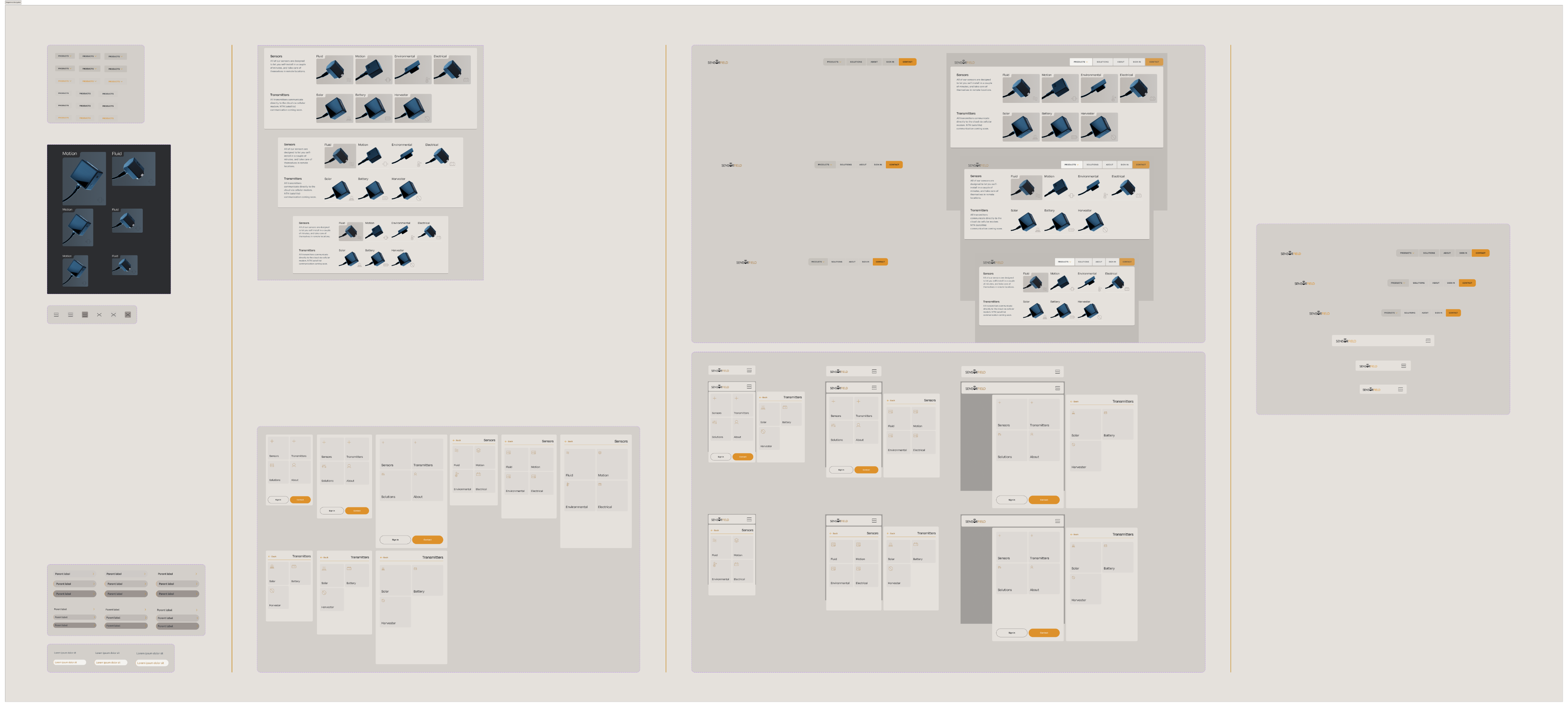
Within a month of that project I had created a new framework, where just three layers could create an infinitely flexible system that could be adapted for any piece of any site. It was only revolutionary for us because it was the first time that how the site would be built was being considered by the designers.
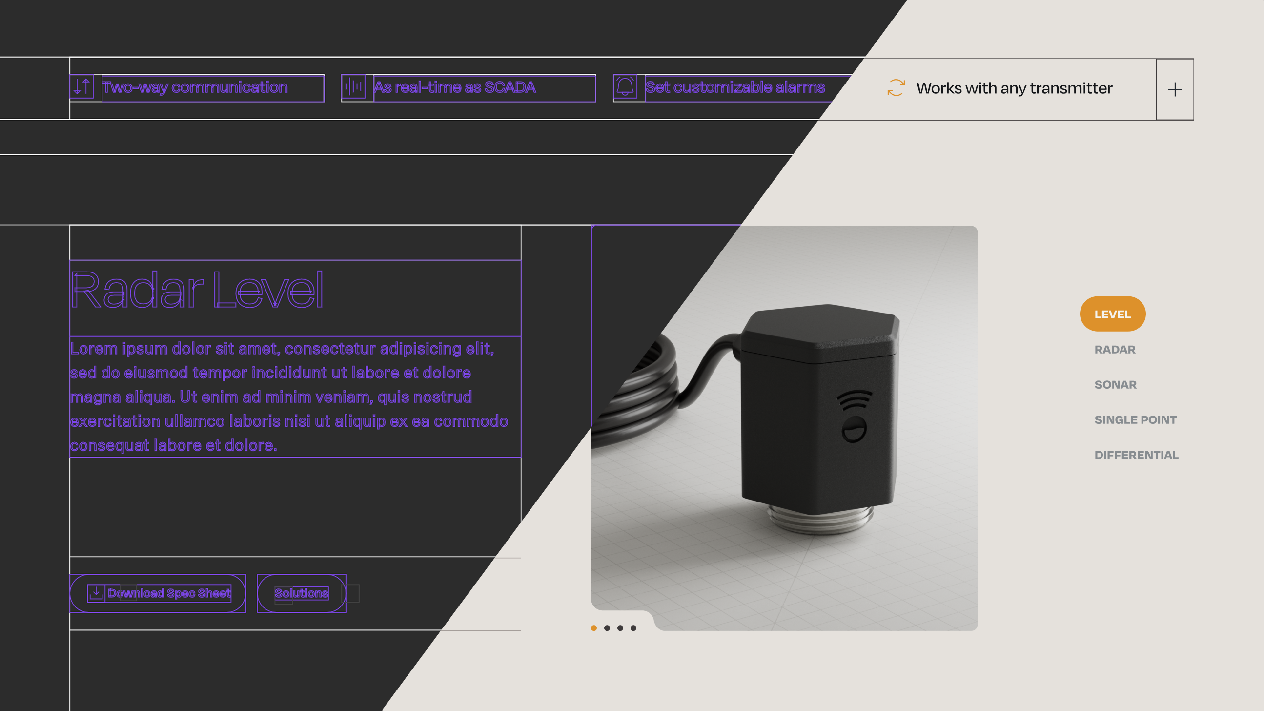
Sections would handle vertical padding and background color, fencing options determined the content area, and layouts like “two-col-offset” could be adapted for any site because they wouldn’t be tied to a column grid any longer. We made tweaks and additions over the years, but this basic framework was rock solid.
Figma Autolayout

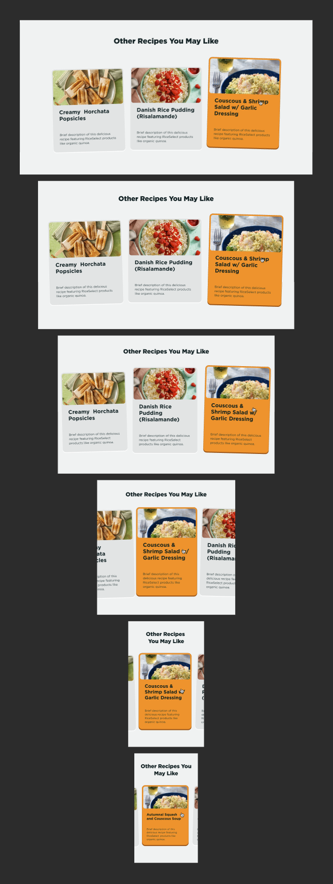
I had jumped onto “Stacks and padding” when XD added them in 2020. And when we moved over to Figma a couple years later, I realized just how much more robust it’s “Autolayout” feature was. It’s been the foundation for our responsive design system, and these days I really can’t see a reason not to use it for everything on a web project.
Using the atomic model of design, and combining autolayout with all of our common components, our wireframes files alone became a more robust system than the final versions a lot of teams hand off to their poor developers.
The pages respected content flow, moving sections around was as simple as hitting an arrow key, and dev never again had to ask us whether we really needed both the 86px gap and the 81px gap they found in different parts of our designs.
Variables! ^0^
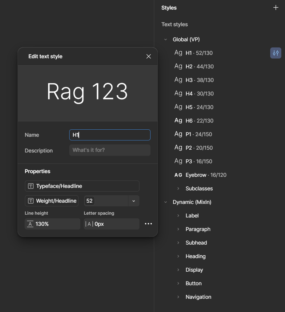
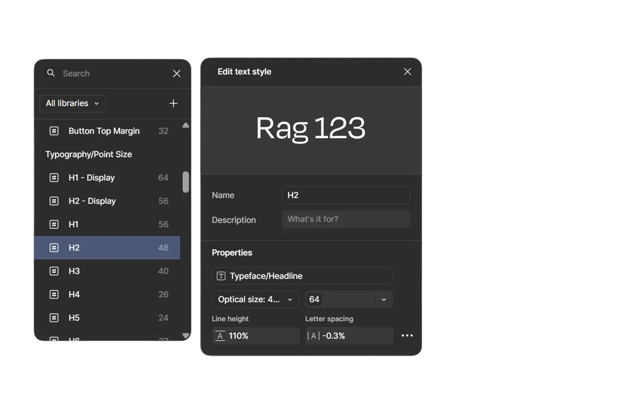
Before variables I’d been keeping all of the values in my head as I worked, setting them manually hundreds of times over the course of a project. When Figma announced variables I immediately started refactoring the entire scaffolding around them.
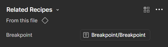
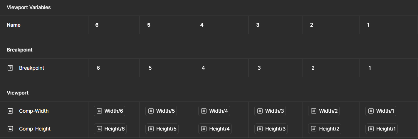
Within a week, the scaffolding had been transformed from a simple wireframe kit into an army of drones. I had variables handling color rules, breakpoints, and every single spacing value from section padding to the vertical gaps in copy.
The design process started to feel more like being a commander giving orders, than a grunt carrying them out for days at a time. I even named my component variants after the breakpoint modes, so they could automatically switch when I dragged out a board and set it to Mobile.


Eyebrow copy
Not to sound overzealous, but for me, this feels like the end-game for flexible web design frameworks.
The only reason I feel comfortable saying something so arrogant as that, is because we iterated on the scaffolding for four years.
Back and forth between developer and designer. Adjusting it every time we felt a bit of friction.
And eventually...
...we just didn’t find much else that we wanted to change.
Thanks for reading. I’m really quite proud of it.
Okay that’s the end


Capital Southwest
Website: Figma, Rive

Nine Energy
Website: Figma, Rive, Photoshop
Baker & O’Brien
Multiple disciplines and software

Contact
Uhhh... Oh yea! Call to action!


The Scaffolding
Work
About
Contact
The job
For years our dev and design teams had a hard time getting along. But over the years I worked with dev to bridge that gap by building a design framework based around the rules of the web.
The Twist
That framework hit lightspeed when Figma introduced variables. All of a sudden every color theme, and every small breakpoint could be systemized. Consistency became automatic.
Inception


The Basic Concepts
Figma Autolayout
Figma Variables
Components
Inception
Everything clicked for me when I realized just how many layouts dev had to code when we designed only with a twelve-col grid.
Seeing 11 layout options in one of our sites’ CMS, (including “5-4”, “4-5”, and “4-5” alt) I realized we needed a new approach. One that started with the layout options, rather than finding the mess we’d made at the end of design.
The job
Within a month of that project I had created a new framework, where just three layers could create an infinitely flexible system that could be adapted for any piece of any site. It was only revolutionary for us because it was the first time that how the site would be built was being considered by the designers.
Sections would handle vertical padding and background color, fencing options determined the content area, and layouts like “two-col-offset” could be adapted for any site because they wouldn’t be tied to a column grid any longer. We made tweaks and additions over the years, but this basic framework was rock solid.
Figma Autolayout

I had jumped onto “Stacks and padding” when XD added them in 2020. And when we moved over to Figma a couple years later, I realized just how much more robust it’s “Autolayout” feature was. It’s been the foundation for our responsive design system, and these days I really can’t see a reason not to use it for everything on a web project.
Using the atomic model of design, and combining autolayout with all of our common components, our wireframes files alone became a more robust system than the final versions a lot of teams hand off to their poor developers.
The pages respected content flow, moving sections around was as simple as hitting an arrow key, and dev never again had to ask us whether we really needed both the 86px gap and the 81px gap they found in different parts of our designs.
Variables! ^0^
Before variables I’d been keeping all of the values in my head as I worked, setting them manually hundreds of times over the course of a project. When Figma announced variables I immediately started refactoring the entire scaffolding around them.
Within a week, the scaffolding had been transformed from a simple wireframe kit into an army of drones. I had variables handling color rules, breakpoints, and every single spacing value from section padding to the vertical gaps in copy.
The design process started to feel more like being a commander giving orders, than a grunt carrying them out for days at a time. I even named my component variants after the breakpoint modes, so they could automatically switch when I dragged out a board and set it to Mobile.
Eyebrow copy
Not to sound overzealous, but for me, this feels like the end-game for flexible web design frameworks.
The only reason I feel comfortable saying something so arrogant as that, is because we iterated on the scaffolding for four years.
Back and forth between developer and designer. Adjusting it every time we felt a bit of friction.
And eventually...
...we just didn’t find much else that we wanted to change.
Thanks for reading. I’m really quite proud of it.
Okay that’s the end

Capital Southwest
Website: Figma, Rive
Nine Energy
Website: Figma, Rive, Photoshop
Baker & O’Brien
Multiple disciplines and software
Contact
Uhhh... Oh yea! Call to action!
The Scaffolding
Work
About
Contact
The job
For years our dev and design teams had a hard time getting along. But over the years I worked with dev to bridge that gap by building a design framework based around the rules of the web.
The Twist
That framework hit lightspeed when Figma introduced variables. All of a sudden every color theme, and every small breakpoint could be systemized. Consistency became automatic.
Inception
The Basic Concepts
Figma Autolayout
Figma Variables
Components
Inception
Everything clicked for me when I realized just how many layouts dev had to code when we designed only with a twelve-col grid.
Seeing 11 layout options in one of our sites’ CMS, (including “5-4”, “4-5”, and “4-5” alt) I realized we needed a new approach. One that started with the layout options, rather than finding the mess we’d made at the end of design.
The job
Within a month of that project I had created a new framework, where just three layers could create an infinitely flexible system that could be adapted for any piece of any site. It was only revolutionary for us because it was the first time that how the site would be built was being considered by the designers.
Sections would handle vertical padding and background color, fencing options determined the content area, and layouts like “two-col-offset” could be adapted for any site because they wouldn’t be tied to a column grid any longer. We made tweaks and additions over the years, but this basic framework was rock solid.
Figma Autolayout

I had jumped onto “Stacks and padding” when XD added them in 2020. And when we moved over to Figma a couple years later, I realized just how much more robust it’s “Autolayout” feature was. It’s been the foundation for our responsive design system, and these days I really can’t see a reason not to use it for everything on a web project.
Using the atomic model of design, and combining autolayout with all of our common components, our wireframes files alone became a more robust system than the final versions a lot of teams hand off to their poor developers.
The pages respected content flow, moving sections around was as simple as hitting an arrow key, and dev never again had to ask us whether we really needed both the 86px gap and the 81px gap they found in different parts of our designs.
Variables! ^0^
Before variables I’d been keeping all of the values in my head as I worked, setting them manually hundreds of times over the course of a project. When Figma announced variables I immediately started refactoring the entire scaffolding around them.
Within a week, the scaffolding had been transformed from a simple wireframe kit into an army of drones. I had variables handling color rules, breakpoints, and every single spacing value from section padding to the vertical gaps in copy.
The design process started to feel more like being a commander giving orders, than a grunt carrying them out for days at a time. I even named my component variants after the breakpoint modes, so they could automatically switch when I dragged out a board and set it to Mobile.
Eyebrow copy
Not to sound overzealous, but for me, this feels like the end-game for flexible web design frameworks.
The only reason I feel comfortable saying something so arrogant as that, is because we iterated on the scaffolding for four years.
Back and forth between developer and designer. Adjusting it every time we felt a bit of friction.
And eventually...
...we just didn’t find much else that we wanted to change.
Thanks for reading. I’m really quite proud of it.
Okay that’s the end

Capital Southwest
Website: Figma, Rive
Nine Energy
Website: Figma, Rive, Photoshop
Baker & O’Brien
Multiple disciplines and software
Contact
Uhhh... Oh yea! Call to action!

The Scaffolding
Work
About
Contact
The job
For years our dev and design teams had a hard time getting along. But over the years I worked with dev to bridge that gap by building a design framework based around the rules of the web.
The Twist
That framework hit lightspeed when Figma introduced variables. All of a sudden every color theme, and every small breakpoint could be systemized. Consistency became automatic.
Inception


The Basic Concepts
Figma Autolayout
Figma Variables
Components
Inception
Everything clicked for me when I realized just how many layouts dev had to code when we designed only with a twelve-col grid.
Seeing 11 layout options in one of our sites’ CMS, (including “5-4”, “4-5”, and “4-5” alt) I realized we needed a new approach. One that started with the layout options, rather than finding the mess we’d made at the end of design.
The job
Within a month of that project I had created a new framework, where just three layers could create an infinitely flexible system that could be adapted for any piece of any site. It was only revolutionary for us because it was the first time that how the site would be built was being considered by the designers.
Sections would handle vertical padding and background color, fencing options determined the content area, and layouts like “two-col-offset” could be adapted for any site because they wouldn’t be tied to a column grid any longer. We made tweaks and additions over the years, but this basic framework was rock solid.
Figma Autolayout

I had jumped onto “Stacks and padding” when XD added them in 2020. And when we moved over to Figma a couple years later, I realized just how much more robust it’s “Autolayout” feature was. It’s been the foundation for our responsive design system, and these days I really can’t see a reason not to use it for everything on a web project.
Using the atomic model of design, and combining autolayout with all of our common components, our wireframes files alone became a more robust system than the final versions a lot of teams hand off to their poor developers.
The pages respected content flow, moving sections around was as simple as hitting an arrow key, and dev never again had to ask us whether we really needed both the 86px gap and the 81px gap they found in different parts of our designs.
Variables! ^0^
Before variables I’d been keeping all of the values in my head as I worked, setting them manually hundreds of times over the course of a project. When Figma announced variables I immediately started refactoring the entire scaffolding around them.
Within a week, the scaffolding had been transformed from a simple wireframe kit into an army of drones. I had variables handling color rules, breakpoints, and every single spacing value from section padding to the vertical gaps in copy.
The design process started to feel more like being a commander giving orders, than a grunt carrying them out for days at a time. I even named my component variants after the breakpoint modes, so they could automatically switch when I dragged out a board and set it to Mobile.
Eyebrow copy
Not to sound overzealous, but for me, this feels like the end-game for flexible web design frameworks.
The only reason I feel comfortable saying something so arrogant as that, is because we iterated on the scaffolding for four years.
Back and forth between developer and designer. Adjusting it every time we felt a bit of friction.
And eventually...
...we just didn’t find much else that we wanted to change.
Thanks for reading. I’m really quite proud of it.
Okay that’s the end

Capital Southwest
Website: Figma, Rive
Nine Energy
Website: Figma, Rive, Photoshop
Baker & O’Brien
Multiple disciplines and software
Contact
Uhhh... Oh yea! Call to action!
The Scaffolding

Work
About
Contact
The job
For years our dev and design teams had a hard time getting along. But over the years I worked with dev to bridge that gap by building a design framework based around the rules of the web.
The Twist
That framework hit lightspeed when Figma introduced variables. All of a sudden every color theme, and every small breakpoint could be systemized. Consistency became automatic.
Inception


The Basic Concepts
Figma Autolayout
Figma Variables
Components
Inception
Everything clicked for me when I realized just how many layouts dev had to code when we designed only with a twelve-col grid.
Seeing 11 layout options in one of our sites’ CMS, (including “5-4”, “4-5”, and “4-5” alt) I realized we needed a new approach. One that started with the layout options, rather than finding the mess we’d made at the end of design.
The job
Within a month of that project I had created a new framework, where just three layers could create an infinitely flexible system that could be adapted for any piece of any site. It was only revolutionary for us because it was the first time that how the site would be built was being considered by the designers.
Sections would handle vertical padding and background color, fencing options determined the content area, and layouts like “two-col-offset” could be adapted for any site because they wouldn’t be tied to a column grid any longer. We made tweaks and additions over the years, but this basic framework was rock solid.
Figma Autolayout

I had jumped onto “Stacks and padding” when XD added them in 2020. And when we moved over to Figma a couple years later, I realized just how much more robust it’s “Autolayout” feature was. It’s been the foundation for our responsive design system, and these days I really can’t see a reason not to use it for everything on a web project.
Using the atomic model of design, and combining autolayout with all of our common components, our wireframes files alone became a more robust system than the final versions a lot of teams hand off to their poor developers.
The pages respected content flow, moving sections around was as simple as hitting an arrow key, and dev never again had to ask us whether we really needed both the 86px gap and the 81px gap they found in different parts of our designs.
Variables! ^0^
Before variables I’d been keeping all of the values in my head as I worked, setting them manually hundreds of times over the course of a project. When Figma announced variables I immediately started refactoring the entire scaffolding around them.
Within a week, the scaffolding had been transformed from a simple wireframe kit into an army of drones. I had variables handling color rules, breakpoints, and every single spacing value from section padding to the vertical gaps in copy.
The design process started to feel more like being a commander giving orders, than a grunt carrying them out for days at a time. I even named my component variants after the breakpoint modes, so they could automatically switch when I dragged out a board and set it to Mobile.
Eyebrow copy
Not to sound overzealous, but for me, this feels like the end-game for flexible web design frameworks.
The only reason I feel comfortable saying something so arrogant as that, is because we iterated on the scaffolding for four years.
Back and forth between developer and designer. Adjusting it every time we felt a bit of friction.
And eventually...
...we just didn’t find much else that we wanted to change.
Thanks for reading. I’m really quite proud of it.
Okay that’s the end

Capital Southwest
Website: Figma, Rive
Nine Energy
Website: Figma, Rive, Photoshop
Baker & O’Brien
Multiple disciplines and software
Contact
Uhhh... Oh yea! Call to action!

The Scaffolding
Work
About
Contact
The job
For years our dev and design teams had a hard time getting along. But over the years I worked with dev to bridge that gap by building a design framework based around the rules of the web.
The Twist
That framework hit lightspeed when Figma introduced variables. All of a sudden every color theme, and every small breakpoint could be systemized. Consistency became automatic.
Inception


The Basic Concepts
Figma Autolayout
Figma Variables
Components
Inception
Everything clicked for me when I realized just how many layouts dev had to code when we designed only with a twelve-col grid.
Seeing 11 layout options in one of our sites’ CMS, (including “5-4”, “4-5”, and “4-5” alt) I realized we needed a new approach. One that started with the layout options, rather than finding the mess we’d made at the end of design.
Within a month of that project I had created a new framework, where just three layers could create an infinitely flexible system that could be adapted for any piece of any site. It was only revolutionary for us because it was the first time that how the site would be built was being considered by the designers.
Sections would handle vertical padding and background color, fencing options determined the content area, and layouts like “two-col-offset” could be adapted for any site because they wouldn’t be tied to a column grid any longer. We made tweaks and additions over the years, but this basic framework was rock solid.
Figma Autolayout

I had jumped onto “Stacks and padding” when XD added them in 2020. And when we moved over to Figma a couple years later, I realized just how much more robust it’s “Autolayout” feature was. It’s been the foundation for our responsive design system, and these days I really can’t see a reason not to use it for everything on a web project.
Using the atomic model of design, and combining autolayout with all of our common components, our wireframes files alone became a more robust system than the final versions a lot of teams hand off to their poor developers.
The pages respected content flow, moving sections around was as simple as hitting an arrow key, and dev never again had to ask us whether we really needed both the 86px gap and the 81px gap they found in different parts of our designs.
Variables! ^0^
Before variables I’d been keeping all of the values in my head as I worked, setting them manually hundreds of times over the course of a project. When Figma announced variables I immediately started refactoring the entire scaffolding around them.
Within a week, the scaffolding had been transformed from a simple wireframe kit into an army of drones. I had variables handling color rules, breakpoints, and every single spacing value from section padding to the vertical gaps in copy.
The design process started to feel more like being a commander giving orders, than a grunt carrying them out for days at a time. I even named my component variants after the breakpoint modes, so they could automatically switch when I dragged out a board and set it to Mobile.
Eyebrow copy
Not to sound overzealous, but for me, this feels like the end-game for flexible web design frameworks.
The only reason I feel comfortable saying something so arrogant as that, is because we iterated on the scaffolding for four years.
Back and forth between developer and designer. Adjusting it every time we felt a bit of friction.
And eventually...
...we just didn’t find much else that we wanted to change.
Thanks for reading. I’m really quite proud of it.
Okay that’s the end

Capital Southwest
Website: Figma, Rive
Nine Energy
Website: Figma, Rive, Photoshop
Baker & O’Brien
Multiple disciplines and software
Contact
Uhhh... Oh yea! Call to action!