Nine Energy

Work
About
Contact
The job
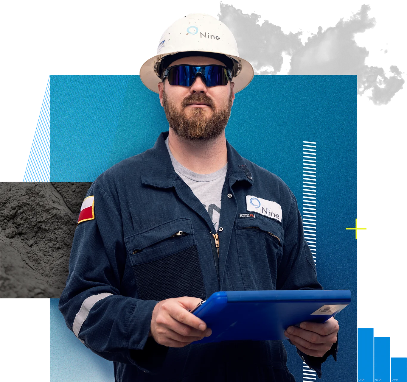
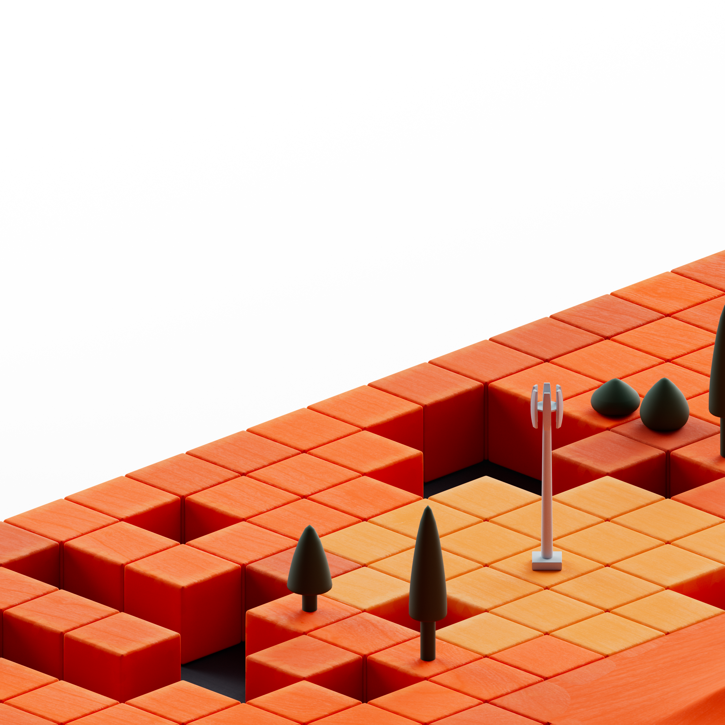
Nine Energy Service had gradually progressed from being the underdog, now to the innovator. So the site needed to set a new vision for the companies brand. One that fit for both the engineers, and the guys in the field.
The Twist
But the site had long become stagnant. And navigation paths that were never reexamined were frustrating and losing people. So before the site could put on it’s makeup, it first had to learn how to walk a straight line.
Existing Product Audit


Sitemap & Wireframes
Style Tiles
Design & Prototyping
Development
Post Launch
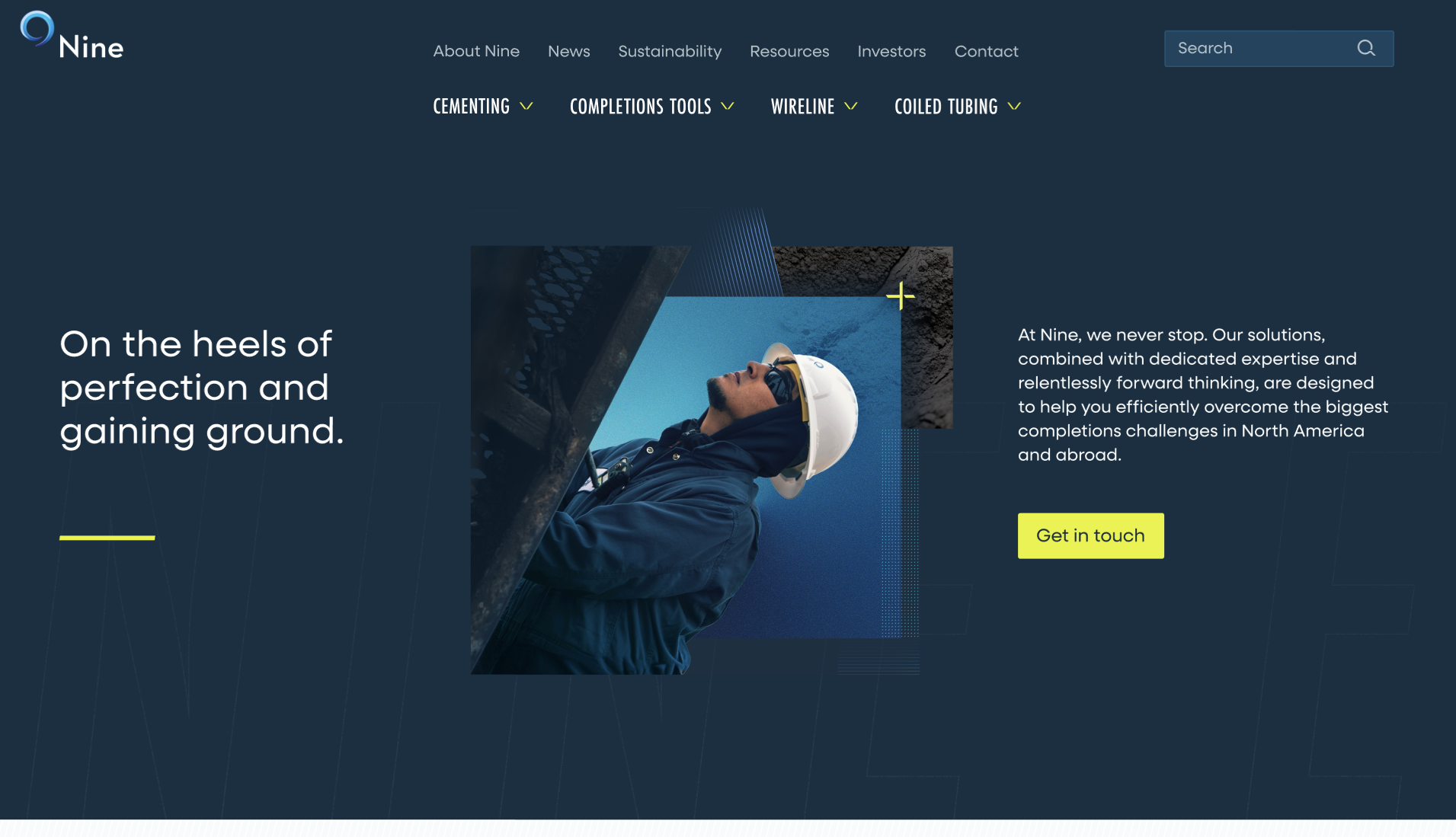
Final Results
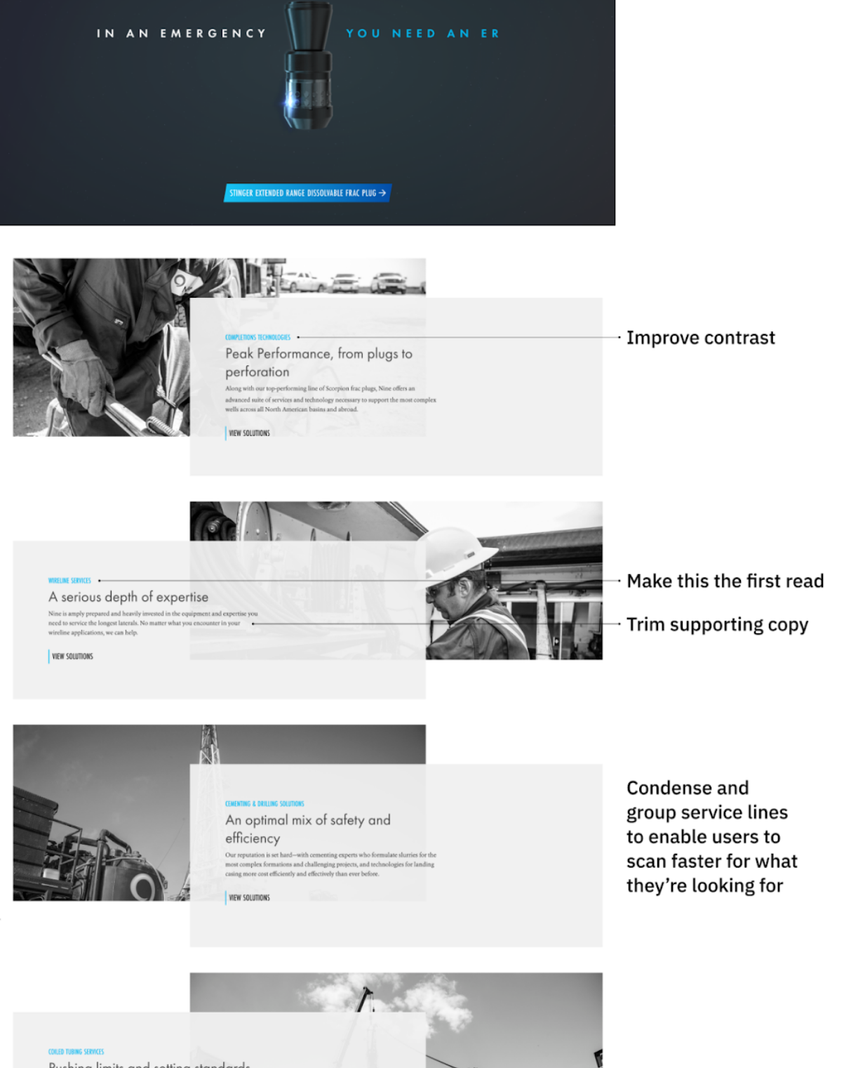
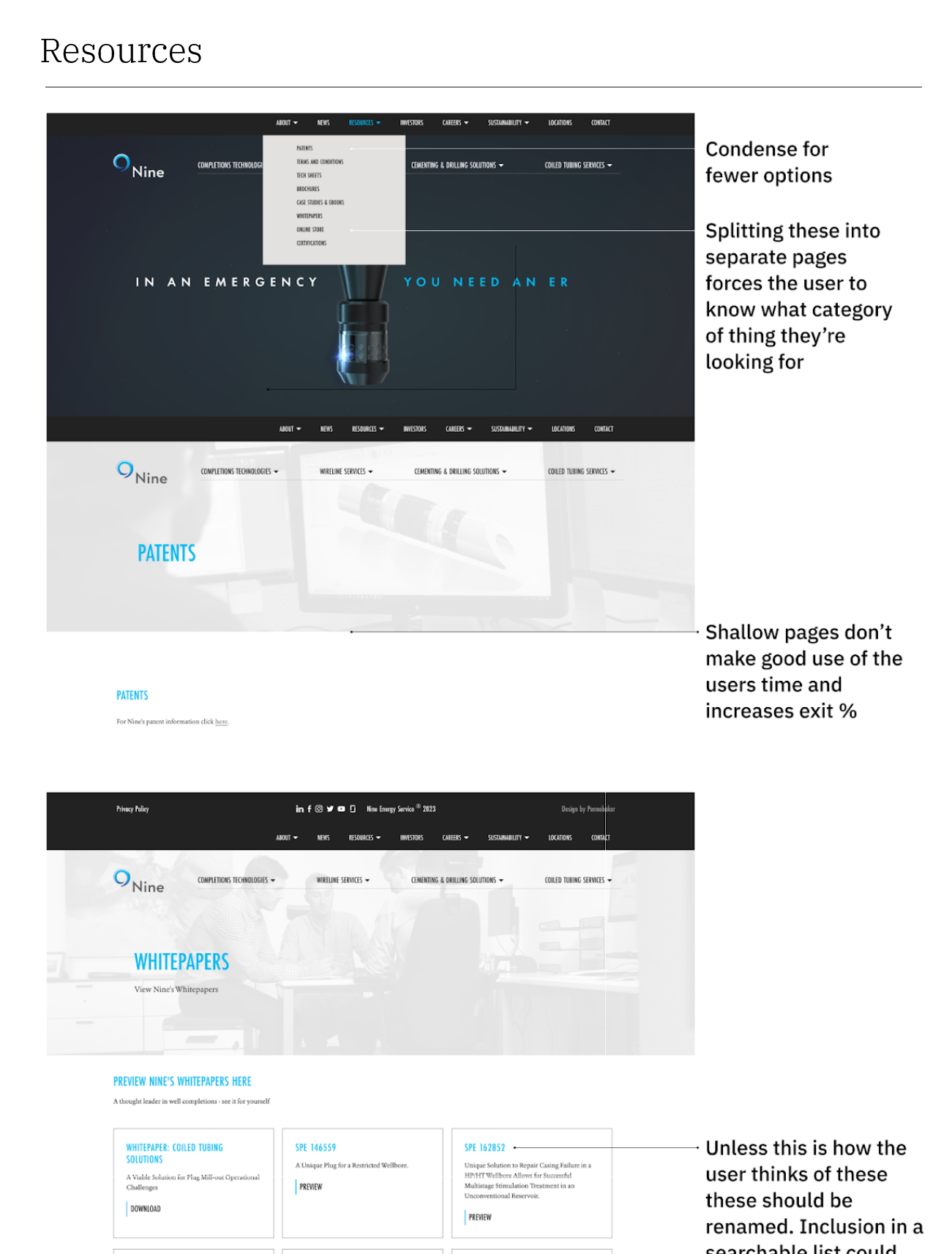
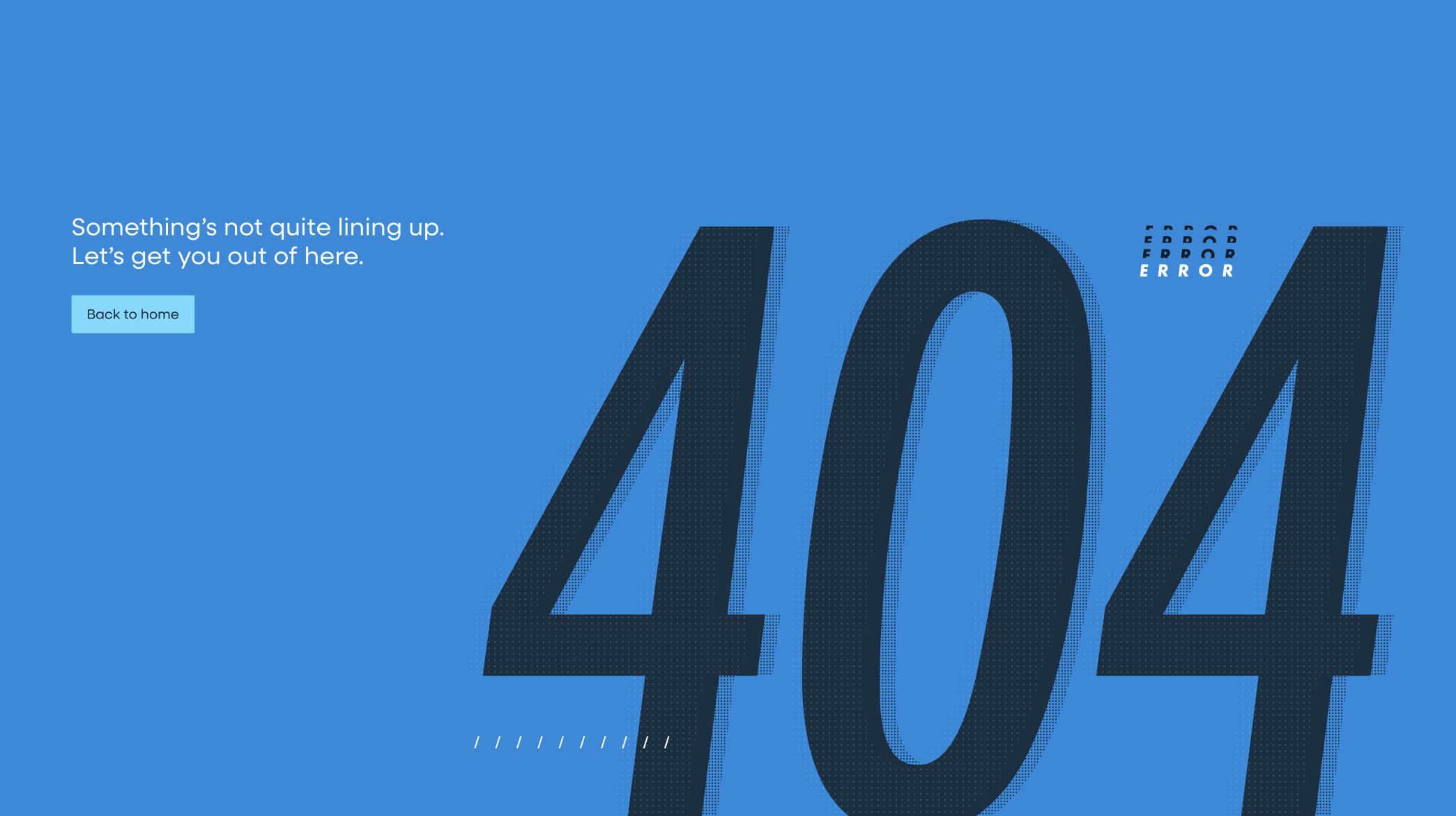
The site was in pretty poor shape. Like a lot of sites, it didn’t see much iteration after launch. And after years of incremental content updates, it had begun to feel like it raised more questions for users than it answered.

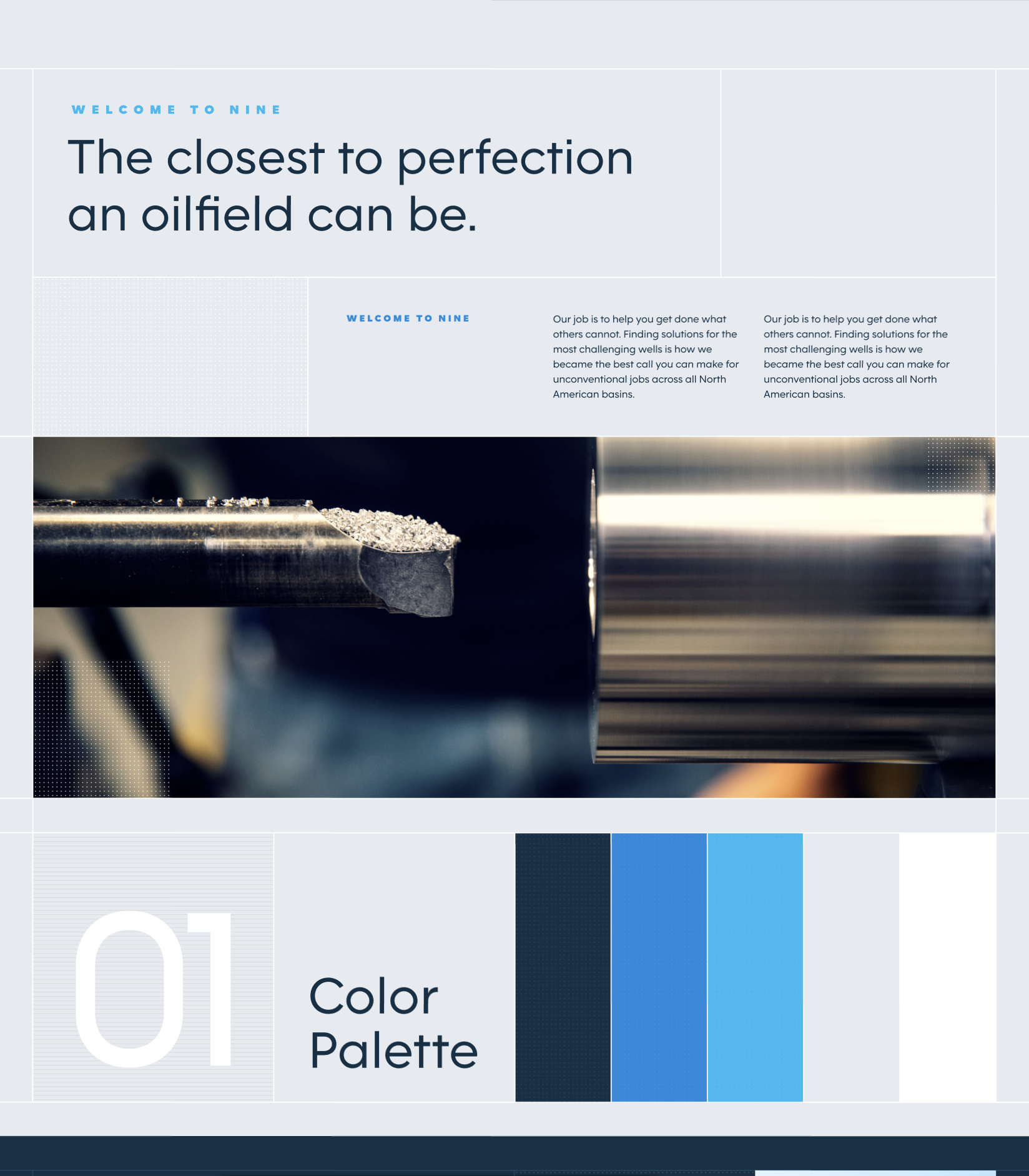
One example from our existing product audit.
Existing Product Audit

The first step in our process at Pennebaker was always to evaluate the clients existing site, in order to get a sense of the clients current content structures, usability problems, and potential opportunities.
In Nine’s case that took the form of a document highlighting the sites main barriers to user interaction and wayfinding, as well as some of the content recommendations that we wanted to carry forward into the redesign.


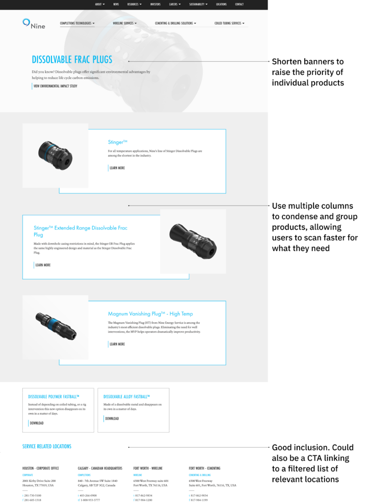
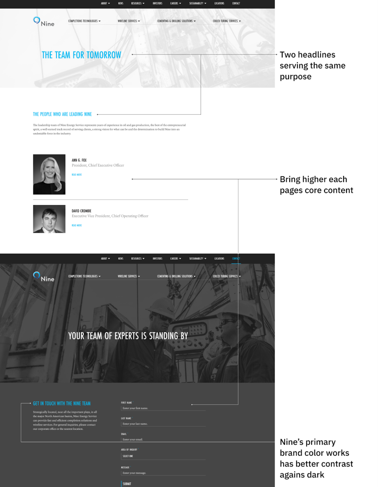
Sitemap & Wireframes
Incremental additions over time had made the sites navigation a bit of a mess. Dead end pages, siloed resources, and very little help understanding the sites hierarchy. However, we did still like how Nine’s four main service lines were given their own space separate from all the other items in the utility nav.
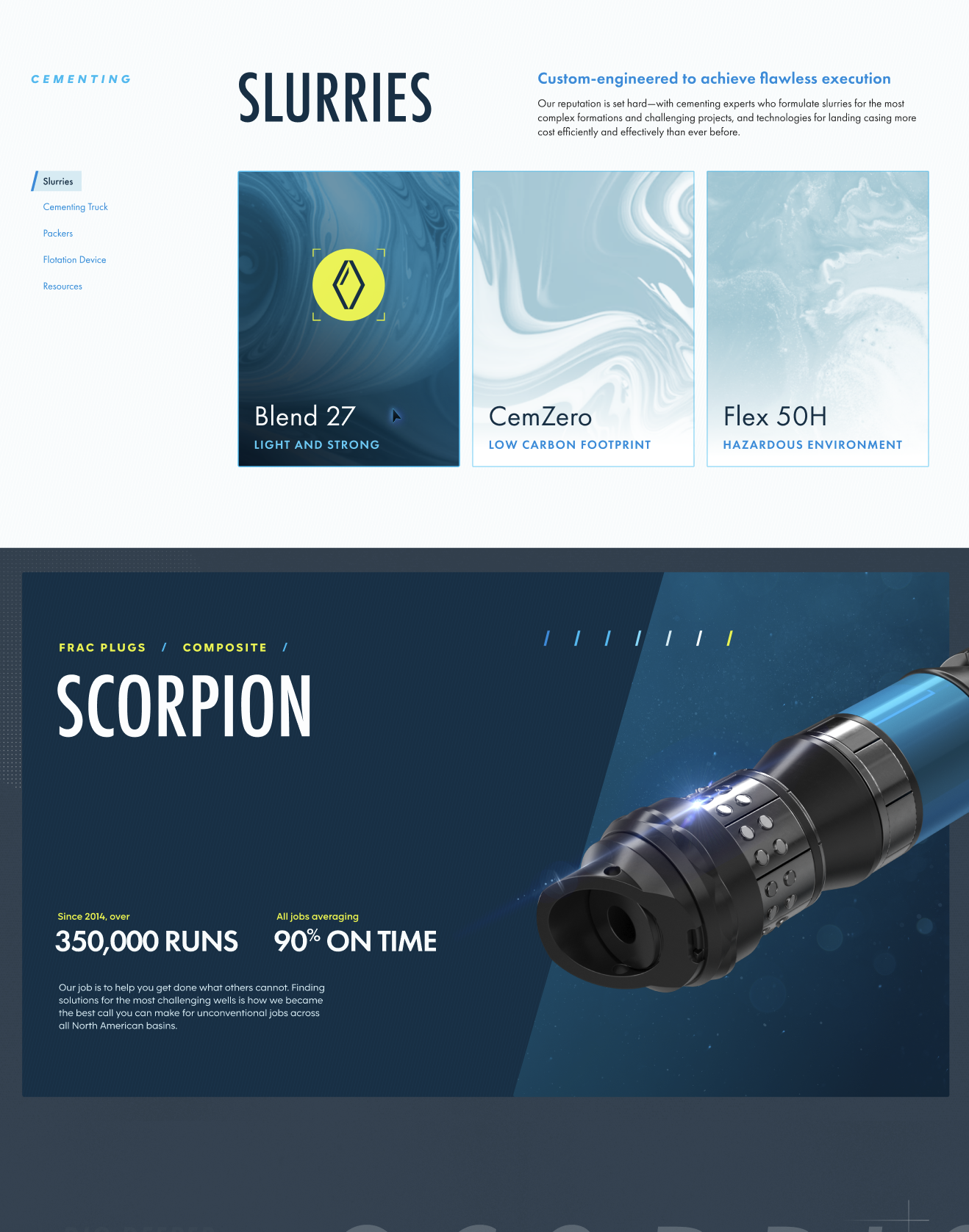
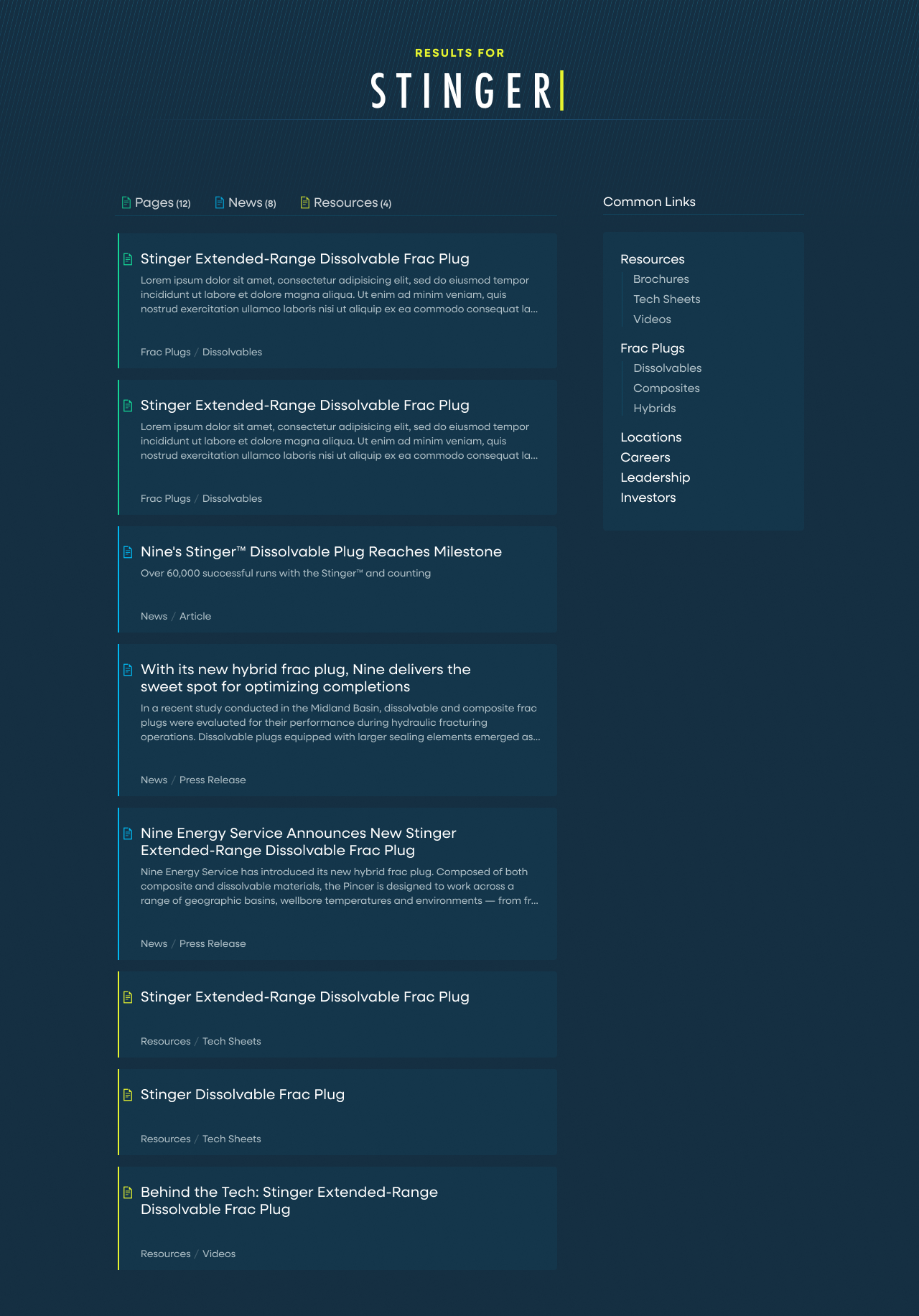
The biggest change and benefit of the new information architecture came in merging all of their tech sheets, videos, brochures, and certifications into one “Resources” page where users could search and filter to find anything they were looking for.
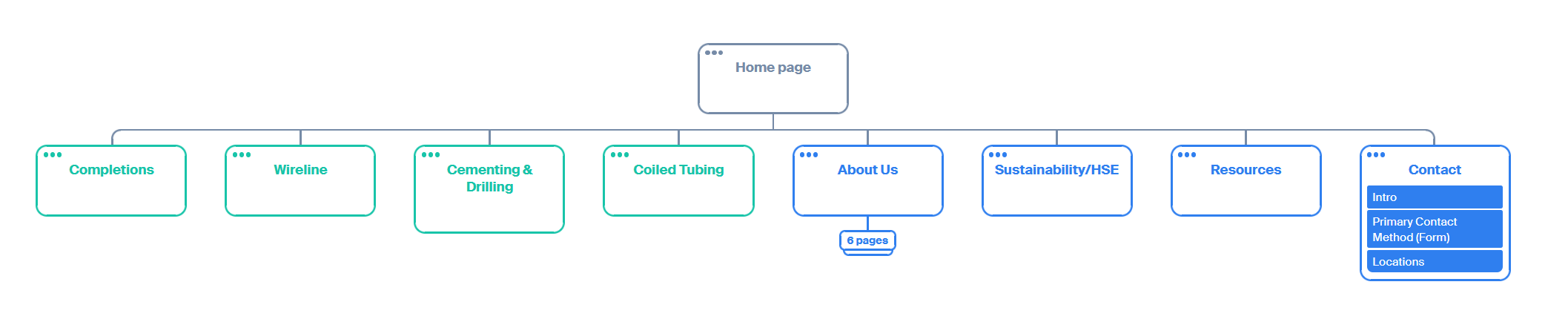
To help users with wayfinding, we focused on adding visible local-navigation for the long service overview pages, anchor links high on product pages to outline what can be found below, and a mega menu that better illustrated how the site is organized.
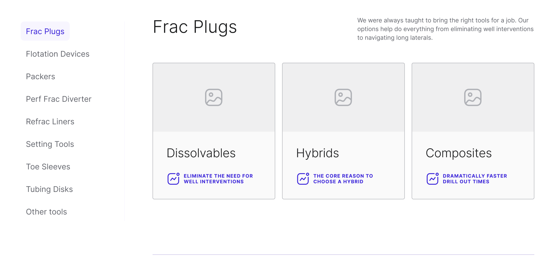
We also made a conscious effort to bring some of the most crucial information on products out of their respective pages, and up to their parents where users would be trying to evaluate what product might be right for them, so they didn’t have to “pogo-stick” into a page and back out again.
This is best exemplified in the cards for Nine’s cementing slurries, which were given icons and descriptions of their ideal use-case.
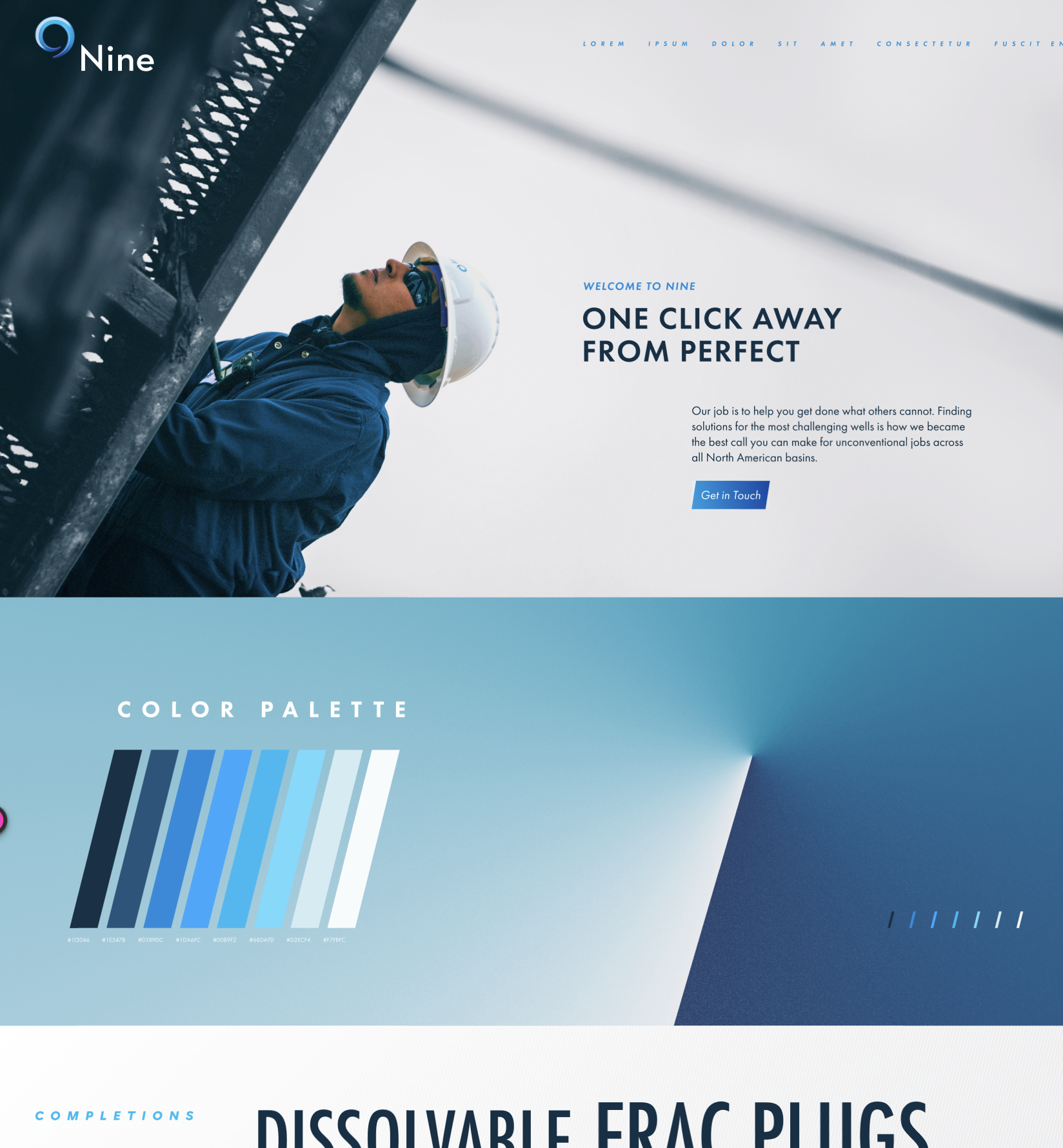
Style Tiles
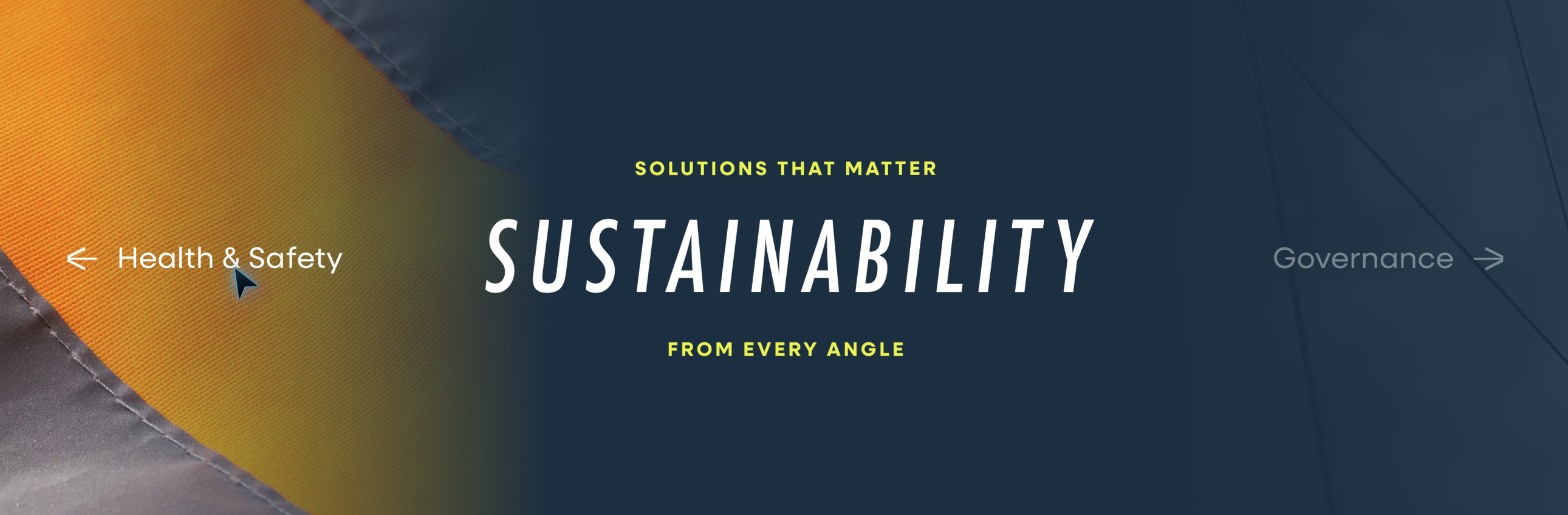
Nine had been a client of Pennebaker for nearly a decade at this point. Starting when Pennebaker helped establish Nine’s initial brand.
But in updating the site, the brand would also see a facelift. Not an overhaul, or anything that would feel like a departure for the brand, but simply an evolution of the brands look and feel.
I and our creative director each created some initial directions. Over a few rounds we pulled elements of each together into the final direction that would set the style for Nine’s updated site and broader identity.
Initial Directions
Chosen Look & Feel
Design & Prototyping
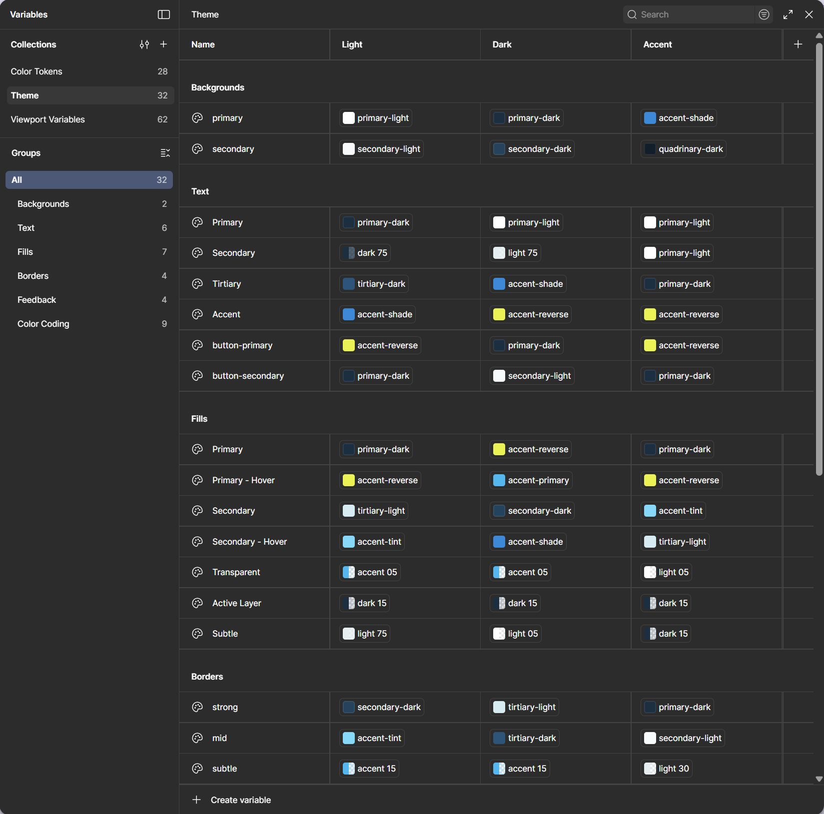
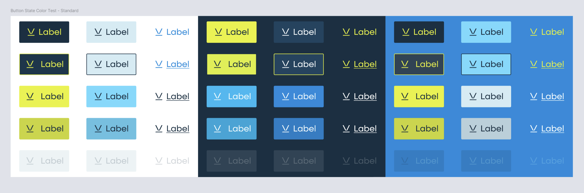
Thanks to the system I created with the dev team over my time at Pennebaker that we called “The Scaffolding”, when we moved into design, we simply duplicated the wireframe file, and already have an intensely robust system to begin the design stage with.
As variables for everything from type to color and spacing get swapped out, the entire design updates and begins to look cohesive in a matter of days. On smaller projects that essentially allows us to get to a pretty good “base model” rather quickly. But for Nine it was just the beginning.
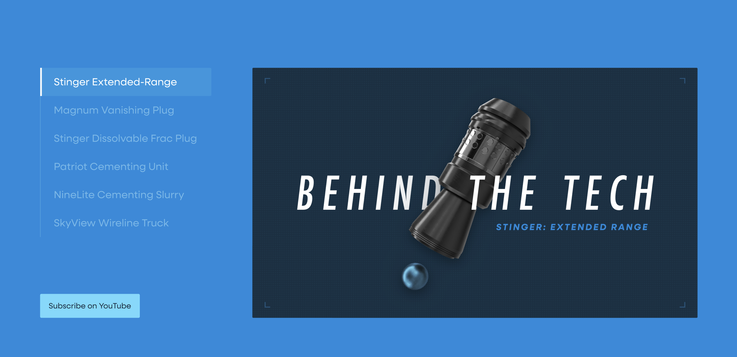
For Nine we developed dozens of unique blocks after the initial system was established, and that’s to say nothing of all the icons, collages, and Rive animations that were eventually created for the site.


To help users with wayfinding, we focused on adding visible local-navigation for the long service overview pages, anchor links high on product pages to outline what can be found below, and a mega menu that better illustrated how the site is organized.
We also made a conscious effort to bring some of the most crucial information on products out of their respective pages, and up to their parents where users would be trying to evaluate what product might be right for them, so they didn’t have to “pogo-stick” into a page and back out again.
This is best exemplified in the cards for Nine’s cementing slurries, which were given icons and descriptions of their ideal use-case.
Post Launch Updates and Additions
Global search with color coded categories and custom icons designed by Jessy Melendez.
Expanded sustainability section with custom collages made to parallax with the users curser in Rive.
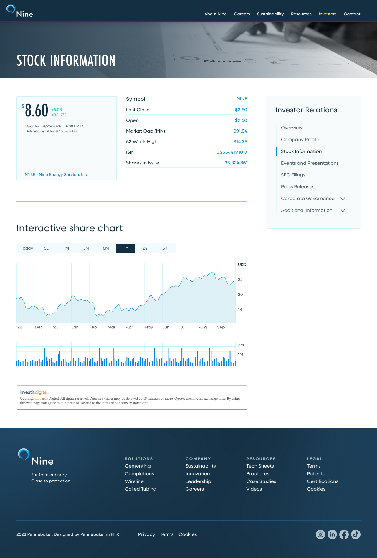
Investor portal built by... I forget. One of those faceless investment companies.
Okay that’s the end

Capital Southwest
Website: Figma, Rive
CoreLogic
Digital Ads: Figma, Rive, C4D
Baker & O’Brien
Multiple disciplines and software

Contact
Uhhh... Oh yea! Call to action!


Nine Energy
Work
About
Contact
The job
Nine Energy Service had gradually progressed from being the underdog, now to the innovator. So the site needed to set a new vision for the companies brand. One that fit for both the engineers, and the guys in the field.
The Twist
But the site had long become stagnant. And navigation paths that were never reexamined were frustrating and losing people. So before the site could put on it’s makeup, it first had to learn how to walk a straight line.
Existing Product Audit


Sitemap & Wireframes
Style Tiles
Design & Prototyping
Development
Post Launch
Final Results
The site was in pretty poor shape. Like a lot of sites, it didn’t see much iteration after launch. And after years of incremental content updates, it had begun to feel like it raised more questions for users than it answered.
One example from our existing product audit.
Existing Product Audit

The first step in our process at Pennebaker was always to evaluate the clients existing site, in order to get a sense of the clients current content structures, usability problems, and potential opportunities.
In Nine’s case that took the form of a document highlighting the sites main barriers to user interaction and wayfinding, as well as some of the content recommendations that we wanted to carry forward into the redesign.
Sitemap & Wireframes
Incremental additions over time had made the sites navigation a bit of a mess. Dead end pages, siloed resources, and very little help understanding the sites hierarchy. However, we did still like how Nine’s four main service lines were given their own space separate from all the other items in the utility nav.
The biggest change and benefit of the new information architecture came in merging all of their tech sheets, videos, brochures, and certifications into one “Resources” page where users could search and filter to find anything they were looking for.
To help users with wayfinding, we focused on adding visible local-navigation for the long service overview pages, anchor links high on product pages to outline what can be found below, and a mega menu that better illustrated how the site is organized.
We also made a conscious effort to bring some of the most crucial information on products out of their respective pages, and up to their parents where users would be trying to evaluate what product might be right for them, so they didn’t have to “pogo-stick” into a page and back out again.
This is best exemplified in the cards for Nine’s cementing slurries, which were given icons and descriptions of their ideal use-case.
Style Tiles
Nine had been a client of Pennebaker for nearly a decade at this point. Starting when Pennebaker helped establish Nine’s initial brand.
But in updating the site, the brand would also see a facelift. Not an overhaul, or anything that would feel like a departure for the brand, but simply an evolution of the brands look and feel.
I and our creative director each created some initial directions. Over a few rounds we pulled elements of each together into the final direction that would set the style for Nine’s updated site and broader identity.
Initial Directions
Chosen Look & Feel
Design & Prototyping
Thanks to the system I created with the dev team over my time at Pennebaker that we called “The Scaffolding”, when we moved into design, we simply duplicated the wireframe file, and already have an intensely robust system to begin the design stage with.
As variables for everything from type to color and spacing get swapped out, the entire design updates and begins to look cohesive in a matter of days. On smaller projects that essentially allows us to get to a pretty good “base model” rather quickly. But for Nine it was just the beginning.
For Nine we developed dozens of unique blocks after the initial system was established, and that’s to say nothing of all the icons, collages, and Rive animations that were eventually created for the site.

To help users with wayfinding, we focused on adding visible local-navigation for the long service overview pages, anchor links high on product pages to outline what can be found below, and a mega menu that better illustrated how the site is organized.
We also made a conscious effort to bring some of the most crucial information on products out of their respective pages, and up to their parents where users would be trying to evaluate what product might be right for them, so they didn’t have to “pogo-stick” into a page and back out again.
This is best exemplified in the cards for Nine’s cementing slurries, which were given icons and descriptions of their ideal use-case.
Post Launch Updates and Additions
Global search with color coded categories and custom icons designed by Jessy Melendez.
Expanded sustainability section with custom collages made to parallax with the users curser in Rive.
Investor portal built by... I forget. One of those faceless investment companies.
Okay that’s the end

Capital Southwest
Website: Figma, Rive
CoreLogic
Digital Ads: Figma, Rive, C4D
Baker & O’Brien
Multiple disciplines and software
Contact
Uhhh... Oh yea! Call to action!
Nine Energy
Work
About
Contact
The job
Nine Energy Service had gradually progressed from being the underdog, now to the innovator. So the site needed to set a new vision for the companies brand. One that fit for both the engineers, and the guys in the field.
The Twist
But the site had long become stagnant. And navigation paths that were never reexamined were frustrating and losing people. So before the site could put on it’s makeup, it first had to learn how to walk a straight line.
Existing Product Audit
Sitemap & Wireframes
Style Tiles
Design & Prototyping
Development
Post Launch
Final Results
The site was in pretty poor shape. Like a lot of sites, it didn’t see much iteration after launch. And after years of incremental content updates, it had begun to feel like it raised more questions for users than it answered.
One example from our existing product audit.
Existing Product Audit

The first step in our process at Pennebaker was always to evaluate the clients existing site, in order to get a sense of the clients current content structures, usability problems, and potential opportunities.
In Nine’s case that took the form of a document highlighting the sites main barriers to user interaction and wayfinding, as well as some of the content recommendations that we wanted to carry forward into the redesign.
Sitemap & Wireframes
Incremental additions over time had made the sites navigation a bit of a mess. Dead end pages, siloed resources, and very little help understanding the sites hierarchy. However, we did still like how Nine’s four main service lines were given their own space separate from all the other items in the utility nav.
The biggest change and benefit of the new information architecture came in merging all of their tech sheets, videos, brochures, and certifications into one “Resources” page where users could search and filter to find anything they were looking for.
To help users with wayfinding, we focused on adding visible local-navigation for the long service overview pages, anchor links high on product pages to outline what can be found below, and a mega menu that better illustrated how the site is organized.
We also made a conscious effort to bring some of the most crucial information on products out of their respective pages, and up to their parents where users would be trying to evaluate what product might be right for them, so they didn’t have to “pogo-stick” into a page and back out again.
This is best exemplified in the cards for Nine’s cementing slurries, which were given icons and descriptions of their ideal use-case.
Style Tiles
Nine had been a client of Pennebaker for nearly a decade at this point. Starting when Pennebaker helped establish Nine’s initial brand.
But in updating the site, the brand would also see a facelift. Not an overhaul, or anything that would feel like a departure for the brand, but simply an evolution of the brands look and feel.
I and our creative director each created some initial directions. Over a few rounds we pulled elements of each together into the final direction that would set the style for Nine’s updated site and broader identity.
Initial Directions
Chosen Look & Feel
Design & Prototyping
Thanks to the system I created with the dev team over my time at Pennebaker that we called “The Scaffolding”, when we moved into design, we simply duplicated the wireframe file, and already have an intensely robust system to begin the design stage with.
As variables for everything from type to color and spacing get swapped out, the entire design updates and begins to look cohesive in a matter of days. On smaller projects that essentially allows us to get to a pretty good “base model” rather quickly. But for Nine it was just the beginning.
For Nine we developed dozens of unique blocks after the initial system was established, and that’s to say nothing of all the icons, collages, and Rive animations that were eventually created for the site.

To help users with wayfinding, we focused on adding visible local-navigation for the long service overview pages, anchor links high on product pages to outline what can be found below, and a mega menu that better illustrated how the site is organized.
We also made a conscious effort to bring some of the most crucial information on products out of their respective pages, and up to their parents where users would be trying to evaluate what product might be right for them, so they didn’t have to “pogo-stick” into a page and back out again.
This is best exemplified in the cards for Nine’s cementing slurries, which were given icons and descriptions of their ideal use-case.
Post Launch Updates and Additions
Global search with color coded categories and custom icons designed by Jessy Melendez.
Expanded sustainability section with custom collages made to parallax with the users curser in Rive.
Investor portal built by... I forget. One of those faceless investment companies.
Okay that’s the end

Capital Southwest
Website: Figma, Rive
CoreLogic
Digital Ads: Figma, Rive, C4D
Baker & O’Brien
Multiple disciplines and software
Contact
Uhhh... Oh yea! Call to action!

Nine Energy
Work
About
Contact
The job
Nine Energy Service had gradually progressed from being the underdog, now to the innovator. So the site needed to set a new vision for the companies brand. One that fit for both the engineers, and the guys in the field.
The Twist
But the site had long become stagnant. And navigation paths that were never reexamined were frustrating and losing people. So before the site could put on it’s makeup, it first had to learn how to walk a straight line.
Existing Product Audit


Sitemap & Wireframes
Style Tiles
Design & Prototyping
Development
Post Launch
Final Results
The site was in pretty poor shape. Like a lot of sites, it didn’t see much iteration after launch. And after years of incremental content updates, it had begun to feel like it raised more questions for users than it answered.
One example from our existing product audit.
Existing Product Audit

The first step in our process at Pennebaker was always to evaluate the clients existing site, in order to get a sense of the clients current content structures, usability problems, and potential opportunities.
In Nine’s case that took the form of a document highlighting the sites main barriers to user interaction and wayfinding, as well as some of the content recommendations that we wanted to carry forward into the redesign.
Sitemap & Wireframes
Incremental additions over time had made the sites navigation a bit of a mess. Dead end pages, siloed resources, and very little help understanding the sites hierarchy. However, we did still like how Nine’s four main service lines were given their own space separate from all the other items in the utility nav.
The biggest change and benefit of the new information architecture came in merging all of their tech sheets, videos, brochures, and certifications into one “Resources” page where users could search and filter to find anything they were looking for.
To help users with wayfinding, we focused on adding visible local-navigation for the long service overview pages, anchor links high on product pages to outline what can be found below, and a mega menu that better illustrated how the site is organized.
We also made a conscious effort to bring some of the most crucial information on products out of their respective pages, and up to their parents where users would be trying to evaluate what product might be right for them, so they didn’t have to “pogo-stick” into a page and back out again.
This is best exemplified in the cards for Nine’s cementing slurries, which were given icons and descriptions of their ideal use-case.
Style Tiles
Nine had been a client of Pennebaker for nearly a decade at this point. Starting when Pennebaker helped establish Nine’s initial brand.
But in updating the site, the brand would also see a facelift. Not an overhaul, or anything that would feel like a departure for the brand, but simply an evolution of the brands look and feel.
I and our creative director each created some initial directions. Over a few rounds we pulled elements of each together into the final direction that would set the style for Nine’s updated site and broader identity.
Initial Directions
Chosen Look & Feel
Design & Prototyping
Thanks to the system I created with the dev team over my time at Pennebaker that we called “The Scaffolding”, when we moved into design, we simply duplicated the wireframe file, and already have an intensely robust system to begin the design stage with.
As variables for everything from type to color and spacing get swapped out, the entire design updates and begins to look cohesive in a matter of days. On smaller projects that essentially allows us to get to a pretty good “base model” rather quickly. But for Nine it was just the beginning.
For Nine we developed dozens of unique blocks after the initial system was established, and that’s to say nothing of all the icons, collages, and Rive animations that were eventually created for the site.

Full Figma Prototype
By the time we reached approvals, we had already been checking in with the client to show our progress. Course correcting and making adjustments along the way. Here’s the Figma prototype as it was when we got approval to move into development.
Post Launch Updates and Additions
Global search with color coded categories and custom icons designed by Jessy Melendez.
Expanded sustainability section with custom collages made to parallax with the users curser in Rive.
Investor portal built by... I forget. One of those faceless investment companies.
Okay that’s the end

Capital Southwest
Website: Figma, Rive
CoreLogic
Digital Ads: Figma, Rive, C4D
Baker & O’Brien
Multiple disciplines and software
Contact
Uhhh... Oh yea! Call to action!
Nine Energy
Work
About
Contact
The job
Nine Energy Service had gradually progressed from being the underdog, now to the innovator. So the site needed to set a new vision for the companies brand. One that fit for both the engineers, and the guys in the field.
The Twist
But the site had long become stagnant. And navigation paths that were never reexamined were frustrating and losing people. So before the site could put on it’s makeup, it first had to learn how to walk a straight line.
Existing Product Audit


Sitemap & Wireframes
Style Tiles
Design & Prototyping
Development
Post Launch
Final Results
The site was in pretty poor shape. Like a lot of sites, it didn’t see much iteration after launch. And after years of incremental content updates, it had begun to feel like it raised more questions for users than it answered.
One example from our existing product audit.
Existing Product Audit

The first step in our process at Pennebaker was always to evaluate the clients existing site, in order to get a sense of the clients current content structures, usability problems, and potential opportunities.
In Nine’s case that took the form of a document highlighting the sites main barriers to user interaction and wayfinding, as well as some of the content recommendations that we wanted to carry forward into the redesign.
Sitemap & Wireframes
Incremental additions over time had made the sites navigation a bit of a mess. Dead end pages, siloed resources, and very little help understanding the sites hierarchy. However, we did still like how Nine’s four main service lines were given their own space separate from all the other items in the utility nav.
The biggest change and benefit of the new information architecture came in merging all of their tech sheets, videos, brochures, and certifications into one “Resources” page where users could search and filter to find anything they were looking for.
To help users with wayfinding, we focused on adding visible local-navigation for the long service overview pages, anchor links high on product pages to outline what can be found below, and a mega menu that better illustrated how the site is organized.
We also made a conscious effort to bring some of the most crucial information on products out of their respective pages, and up to their parents where users would be trying to evaluate what product might be right for them, so they didn’t have to “pogo-stick” into a page and back out again.
This is best exemplified in the cards for Nine’s cementing slurries, which were given icons and descriptions of their ideal use-case.
Style Tiles
Nine had been a client of Pennebaker for nearly a decade at this point. Starting when Pennebaker helped establish Nine’s initial brand.
But in updating the site, the brand would also see a facelift. Not an overhaul, or anything that would feel like a departure for the brand, but simply an evolution of the brands look and feel.
I and our creative director each created some initial directions. Over a few rounds we pulled elements of each together into the final direction that would set the style for Nine’s updated site and broader identity.
Initial Directions
Chosen Look & Feel
Design & Prototyping
Thanks to the system I created with the dev team over my time at Pennebaker that we called “The Scaffolding”, when we moved into design, we simply duplicated the wireframe file, and already have an intensely robust system to begin the design stage with.
As variables for everything from type to color and spacing get swapped out, the entire design updates and begins to look cohesive in a matter of days. On smaller projects that essentially allows us to get to a pretty good “base model” rather quickly. But for Nine it was just the beginning.
For Nine we developed dozens of unique blocks after the initial system was established, and that’s to say nothing of all the icons, collages, and Rive animations that were eventually created for the site.

Full Figma Prototype
By the time we reached approvals, we had already been checking in with the client to show our progress. Course correcting and making adjustments along the way. Here’s the Figma prototype as it was when we got approval to move into development.
Post Launch Updates and Additions
Global search with color coded categories and custom icons designed by Jessy Melendez.
Expanded sustainability section with custom collages made to parallax with the users curser in Rive.
Investor portal built by... I forget. One of those faceless investment companies.
Okay that’s the end

Capital Southwest
Website: Figma, Rive
CoreLogic
Digital Ads: Figma, Rive, C4D
Baker & O’Brien
Multiple disciplines and software
Contact
Uhhh... Oh yea! Call to action!
