CoreLogic

Work
About
Contact
The job
CoreLogic approached our team at Pennebaker to develop direct ads that would bring in clients in telecommunications, by highlighting how their location intelligence could be used to guide both marketing and new projects.
The Twist
Our contact at CoreLogic was pretty rusty on targeted digital ads, and our team had recently been experimenting with Rive. What we got was a new way for our designers to create and animate HTML ads.
Concepting


Look Development
Production
Refresh
Results

The setup
CoreLogic’s Location Intelligence supplies broad, detailed property information to help Telcos plan new infrastructure, and better serve their clients.
Think about when they lay new fiber lines or build new cell towers. You need to know an areas flood risk, population density, bandwidth demands, etc. That’s the data that Telcos rely on CoreLogic for.
Concepting

Because it wouldn’t be enough just to make some pretty ads with off-the-cuff headlines, we started with concepting. What would be the consistent theme across every ad.
For me, coming up with concepts is often best done by writing. So I gathered everything I knew about the project, from the buyer personas to my favorite marketing advice, into Figjam, and started writing headlines.
I don’t stop to criticize things for too long. I mostly just try to let one idea spark another, and another. Until I have enough that I can look back and find the common threads.
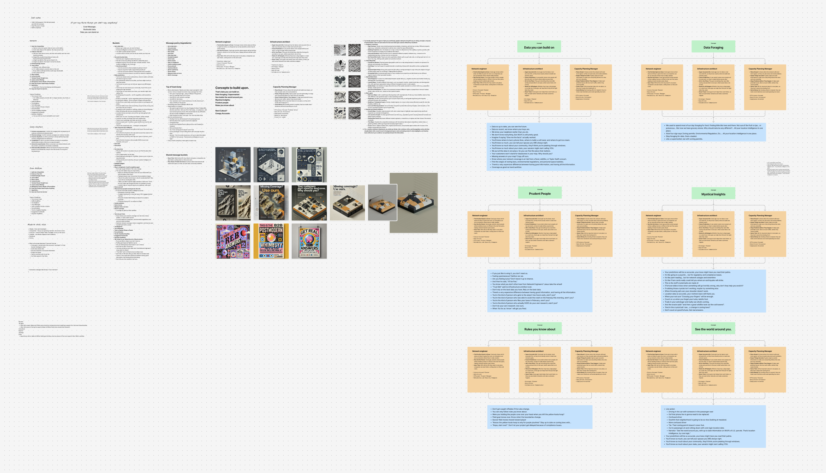

In the end, there were three ideas that I wanted to share with our team at Pennebaker.
Data You Can Build On
For people who build infrastructure, good data is literally foundational. The idea was that CoreLogics data was so trustworthy, Telcos could use it as a sturdy foundation for new projects.
Prudent People
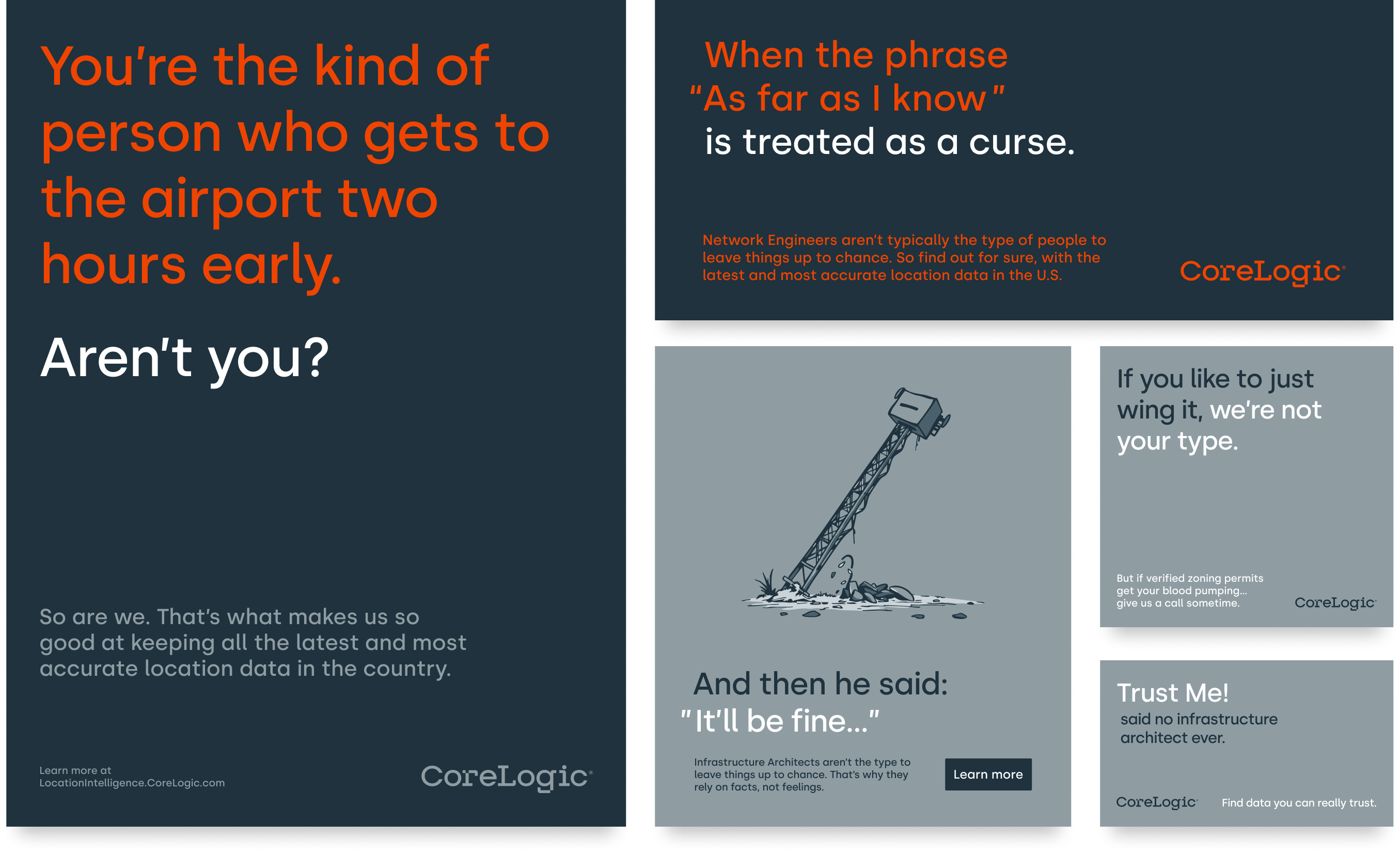
The three personas were all very similar types of people. So let’s talk about them, instead of ourselves. Focus on the type of people the audience was. The kind of people who don’t leave things up to chance.
Get Real Answers
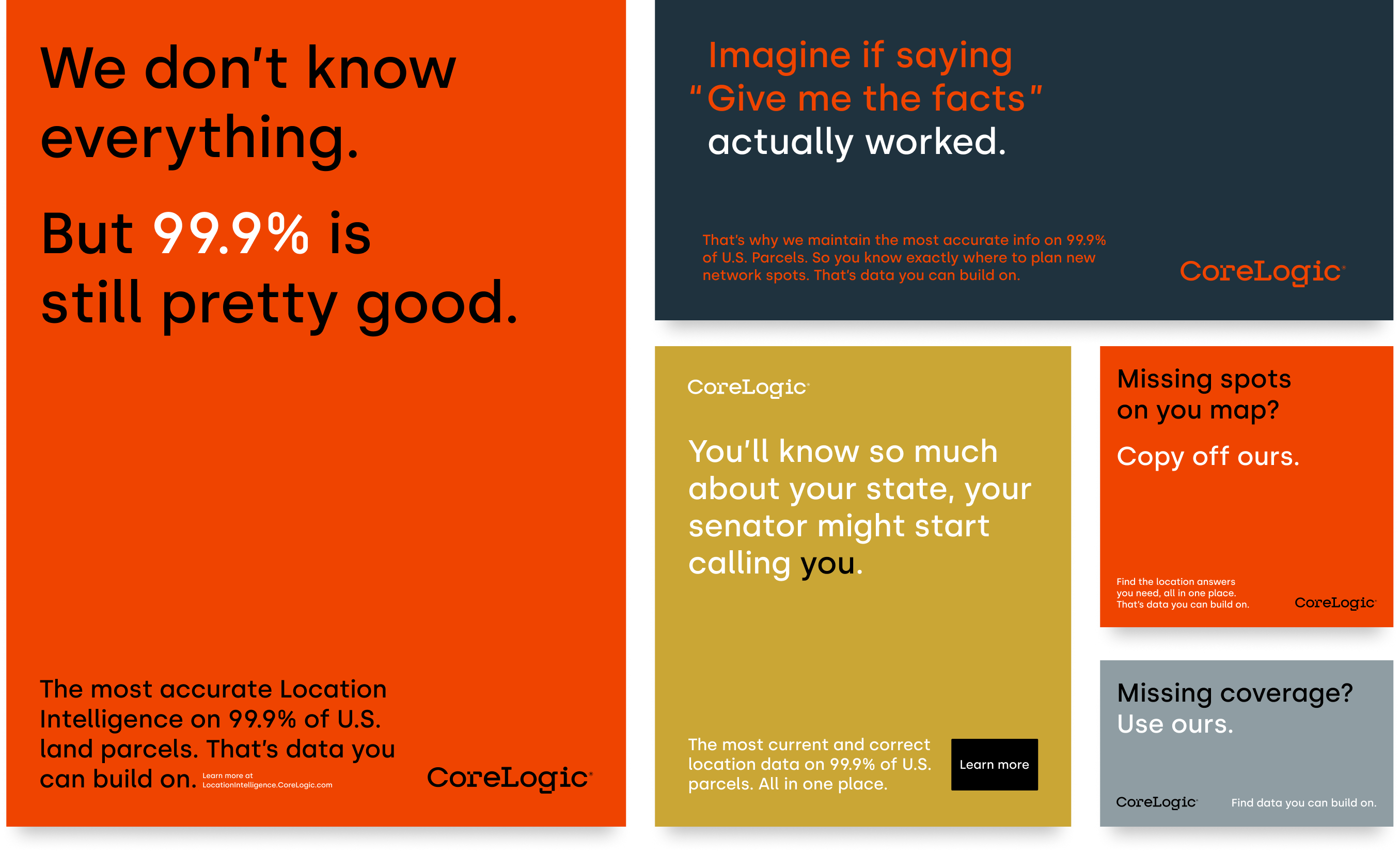
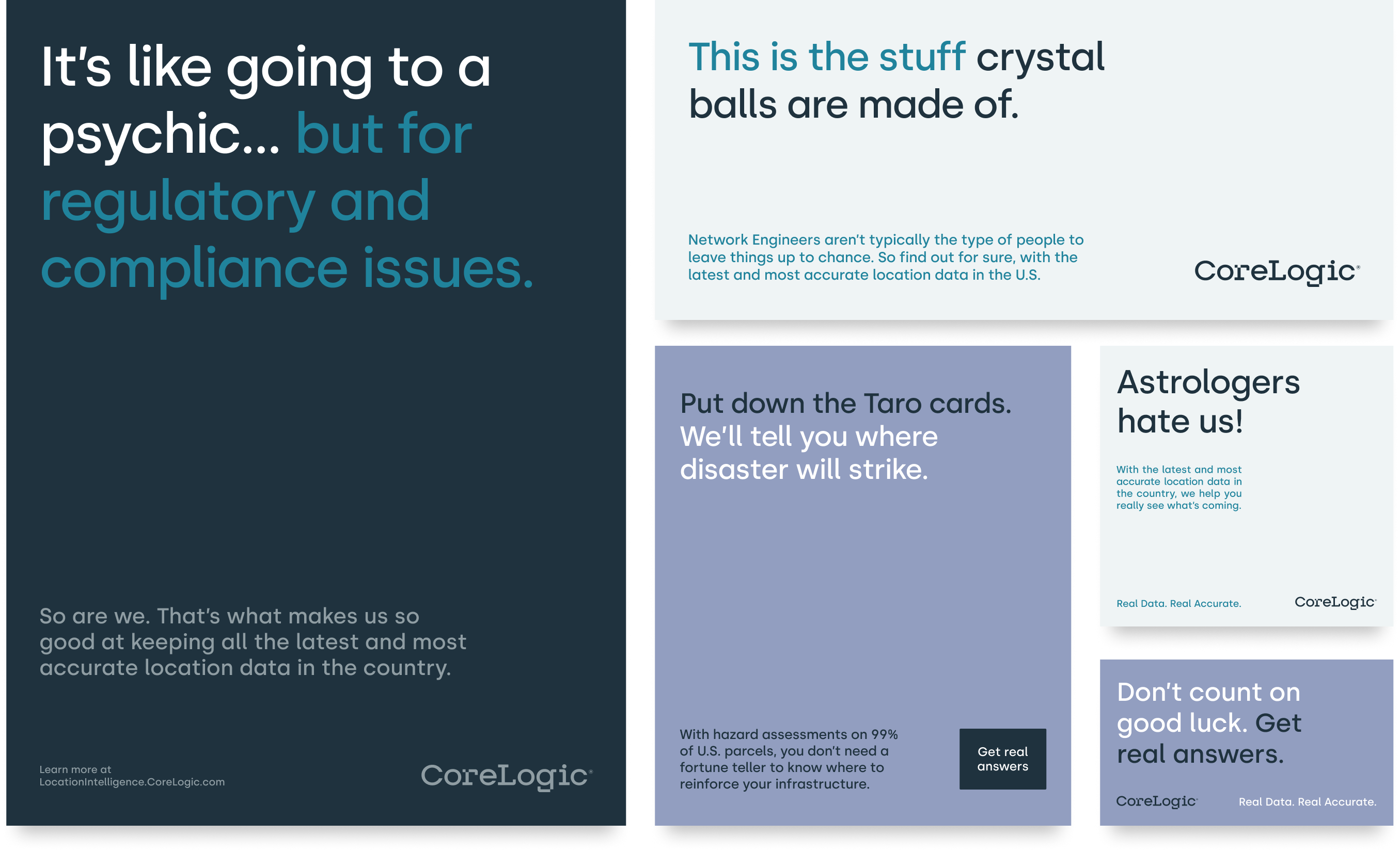
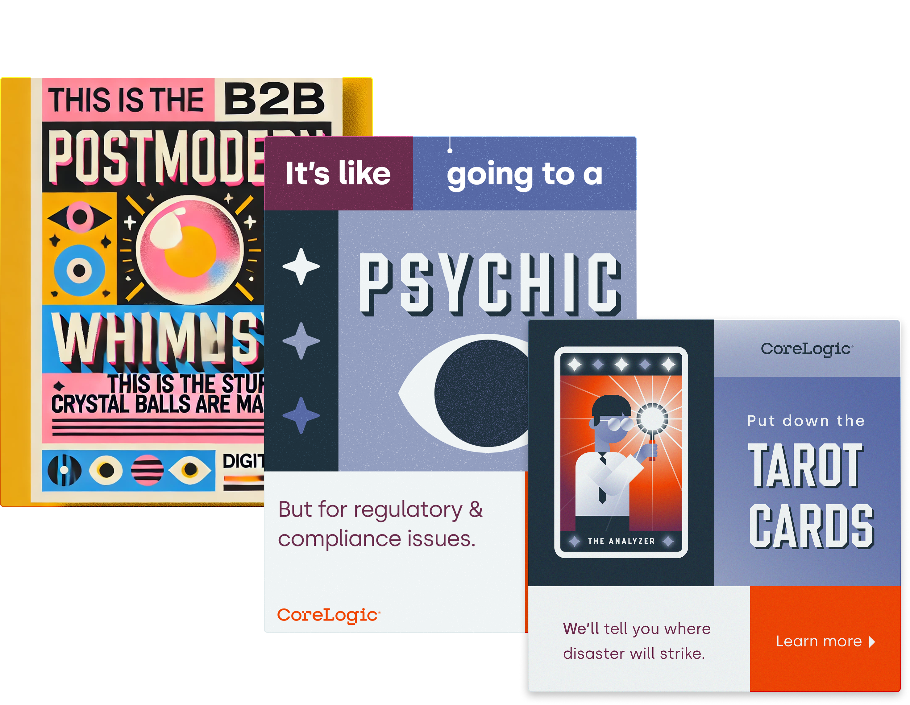
Finally, the spicy option. This idea was based around how good data allowed you to make predictions about the future. And then contrasting those analytical people with the supernatural ways to know the future.
Look Development
Perhaps it comes easier to other designers, but developing a look and feel for me is usually a more meandering process of trial and error. Luckily I had great advisors in Bryant Ju, Alyssa Oliver, and Katie McKay.
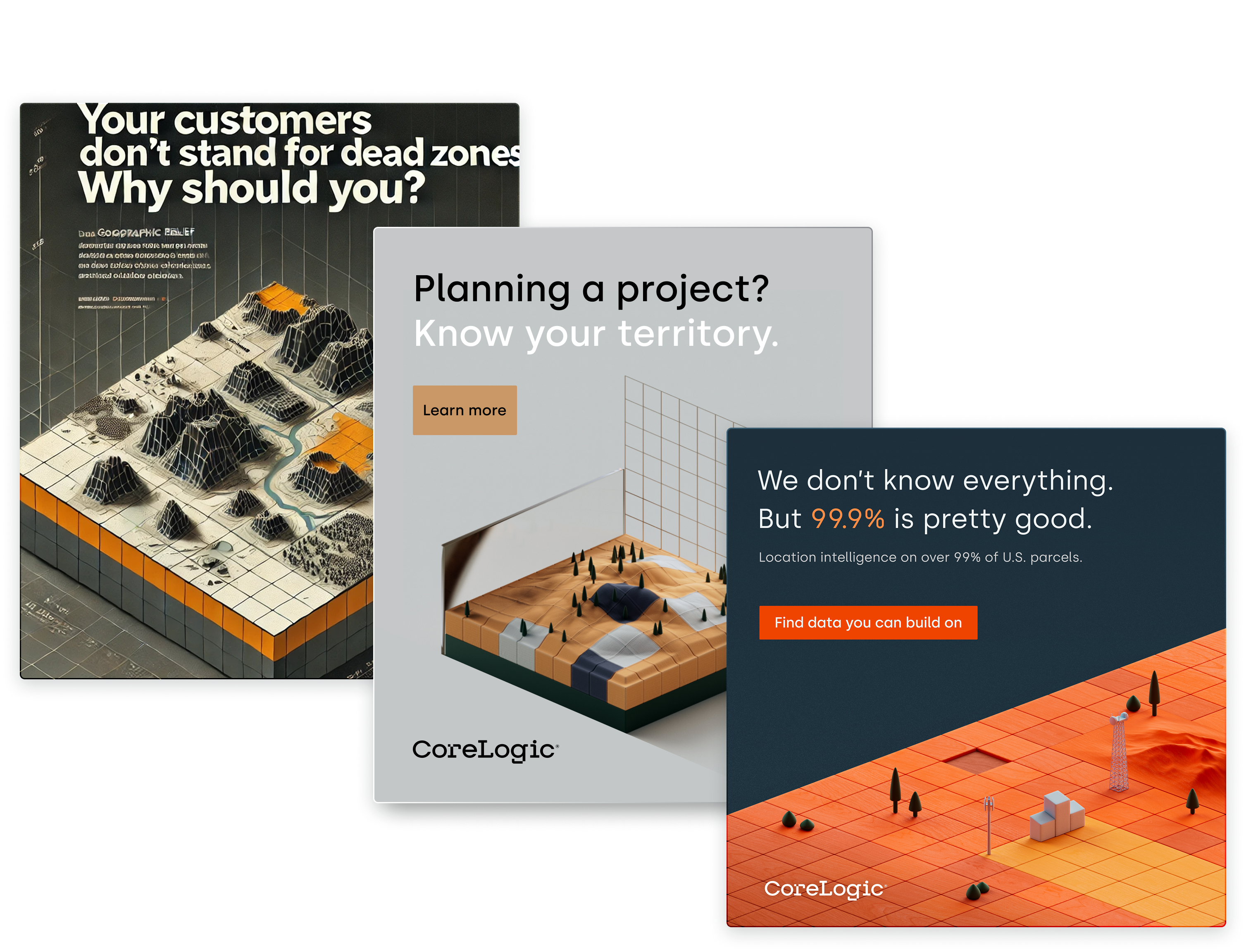
This was also the height of designers trying to figure out how AI might affect our process. So on this project, I used a combination of ChatGPT, reference imagery, and early experiments to iterate into the final look.
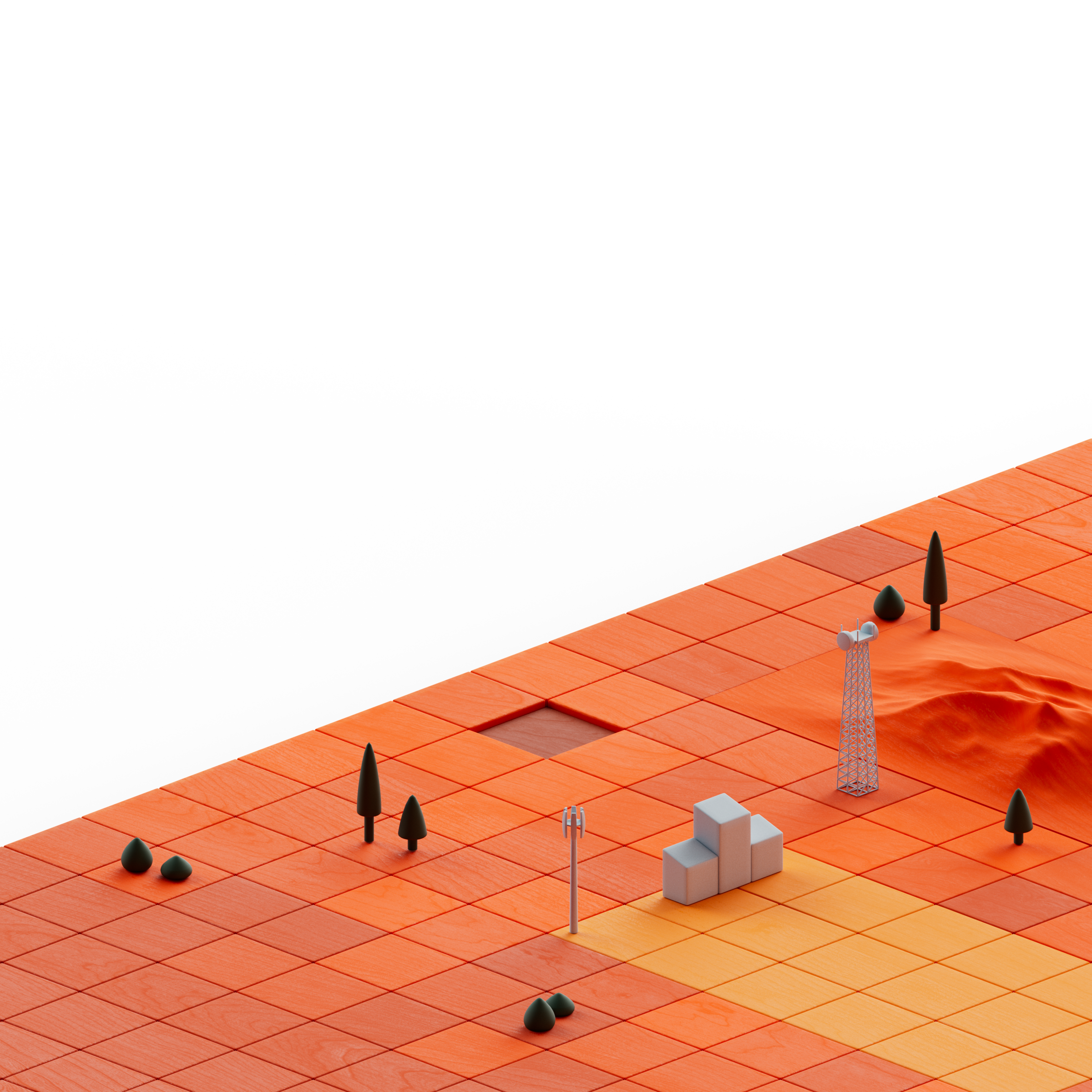
Direction 1: Data You Can Build On
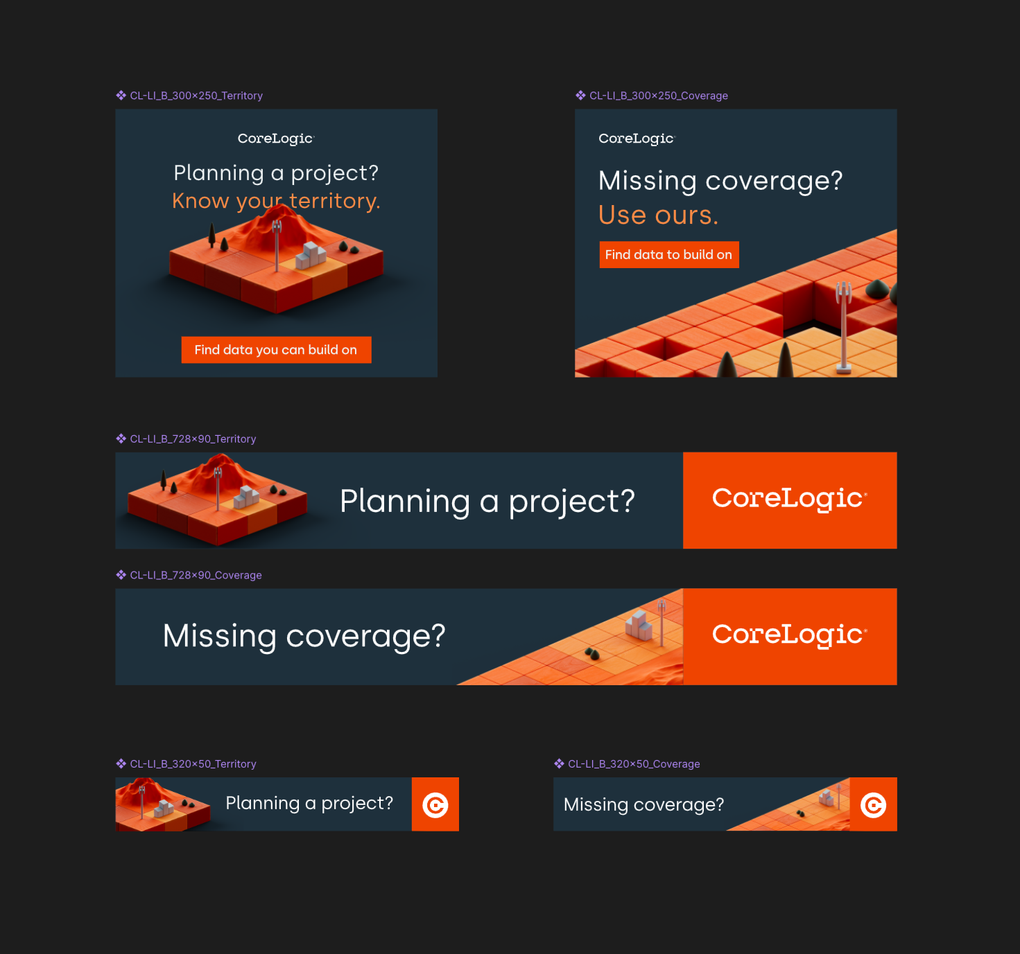
Inspired by the idea of our CoreLogic’s audience using this data to plan their projects by getting a view of the data landscape, I wanted to explore using 3D to create small scenes that felt like looking down on dioramas or map boards. Leaning into the brands complimentary color palette, I created scenes for each headline that felt simple, clear, and intentional.
Direction 2: Prudent People
One of the things that the client had mentioned was that their data is both broad and deep. Down to having specific flood histories on individual properties. Combine very technical data with an elevated, analytical feel, and the work of Carl Hauser immediately sprang to mind. I created a quick test render to use as the looks proof of concept to test the clients appetite for tone and whether they would want us to hire a third party like Carl.

Direction 3: Get Real Answers
Knowing that the headlines were on the whimsical side of things, we wanted to look at using their secondary palette that didn’t get much use to bolster a different look for the brand. Essentially, the cool secondary colors would represent the mystical parts of our headline, and end with CoreLogic’s orange; the grounded antidote to the ambiguous superstitions. Illustrations and the final look were created by the pinkest metalhead you’ll ever meet, Alyssa Oliver.
Design and Production
The client decided to hold the spicy option for a future campaign, and use “Data You Can build On” for this initial run. It would also be A/B tested against another direction designed by the absolutely fabulous Bryant Ju.
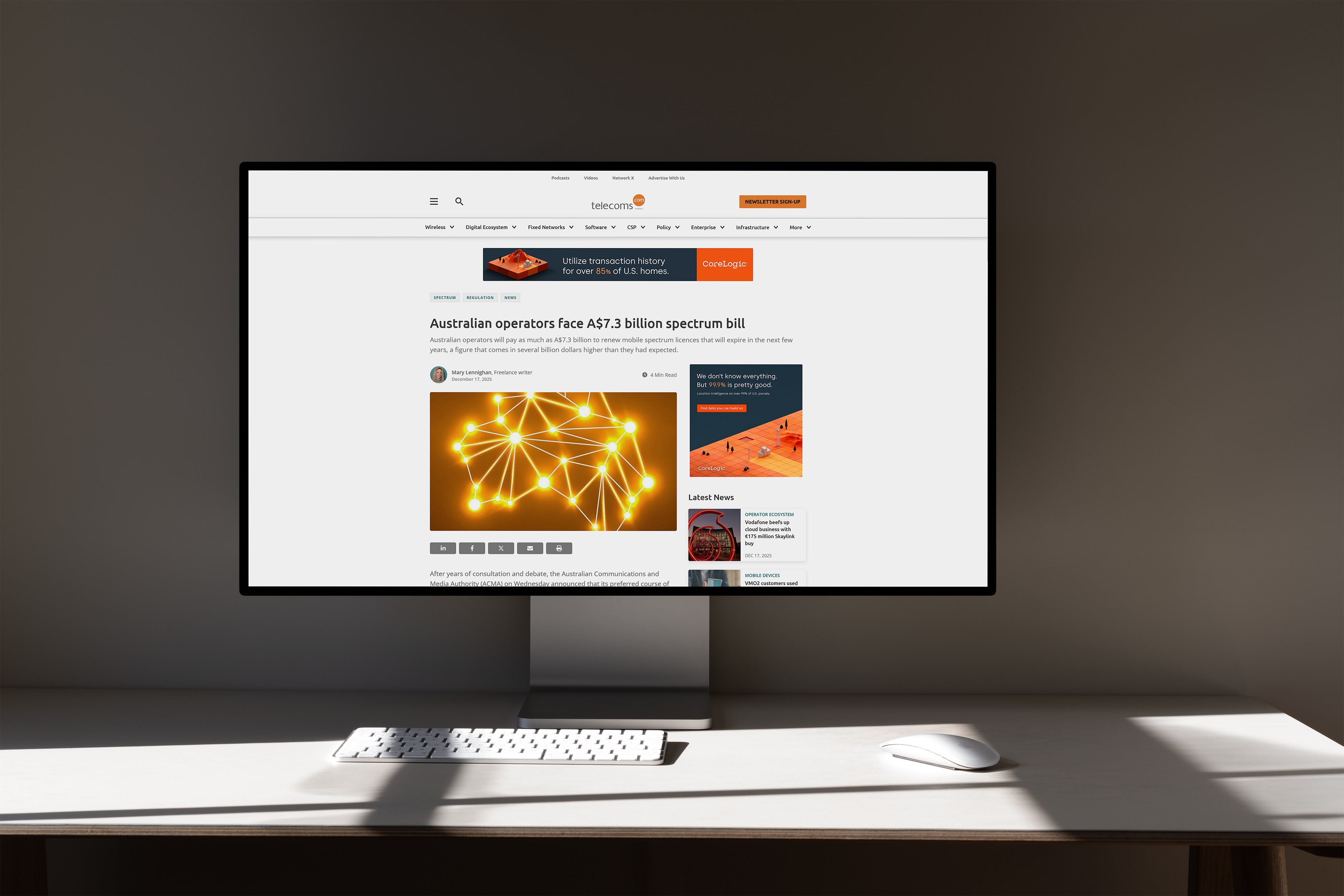
We went through a couple rounds of edits, and added two more ads to the set. Creating each 3D scene in Cinema 4D, laying them out in Figma, animating them in Rive, and embedding those into HTML files.
I handled most aspects of their creation. But crucially with the help of Hayden Taylor for additional writing, Katie McKay for art direction, and Spenser Hannon for code support integrating the ads with the clients platform.

Designed in Figma | 3D Rendered in C4D | Animated in Rive | Embedded into HTML


Oh, by the way, we’re rebranding”
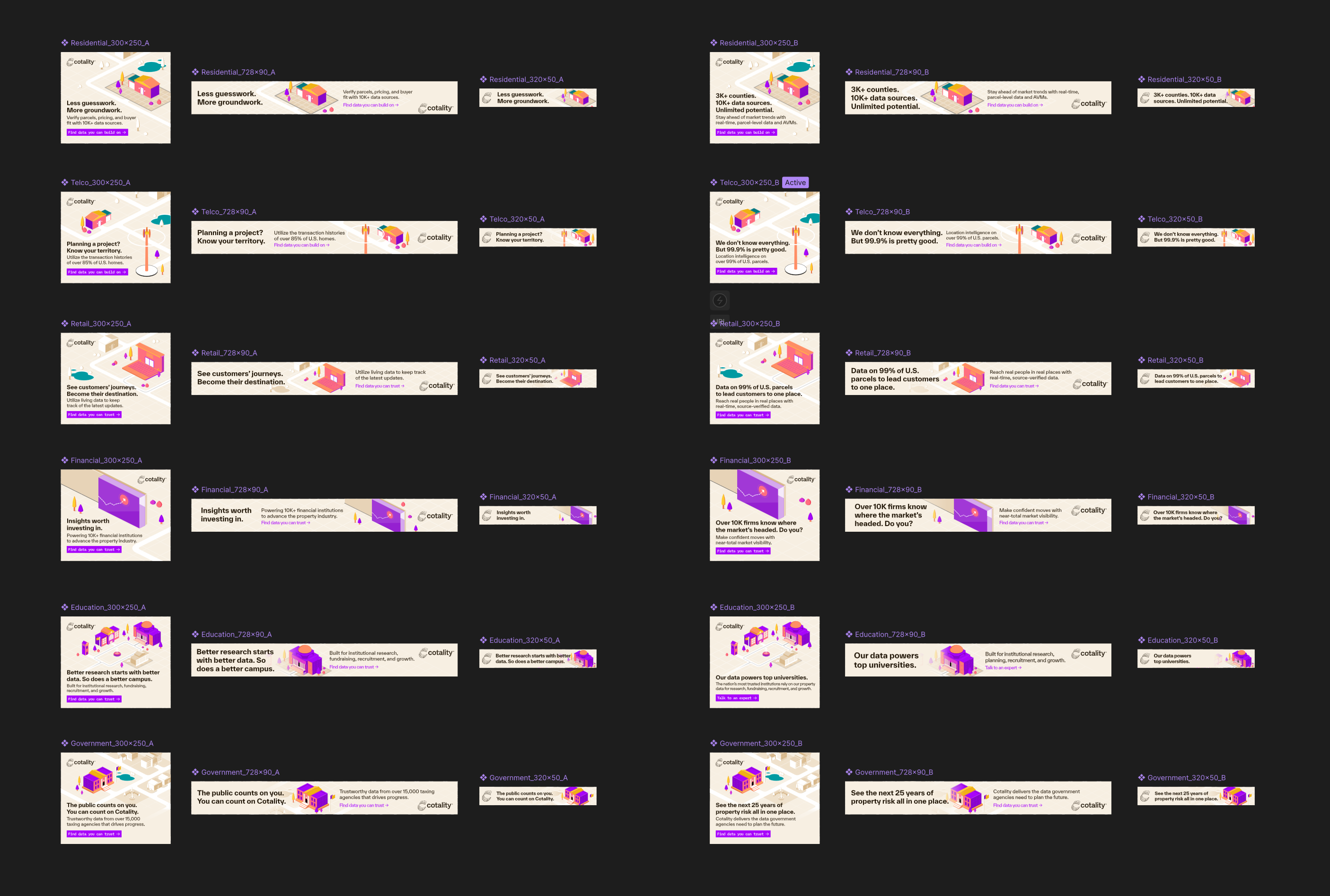
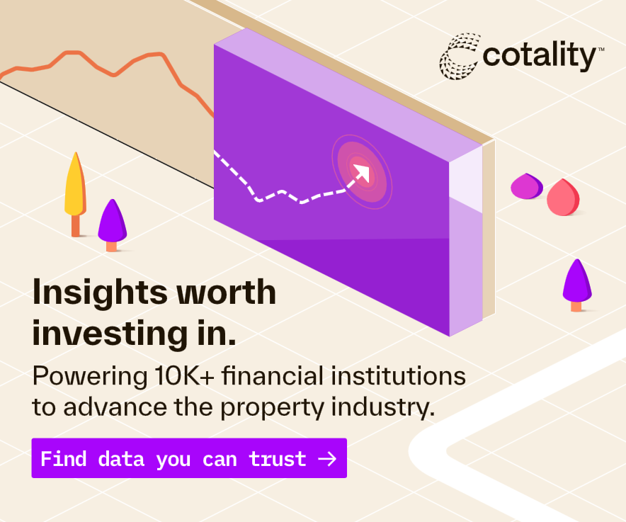
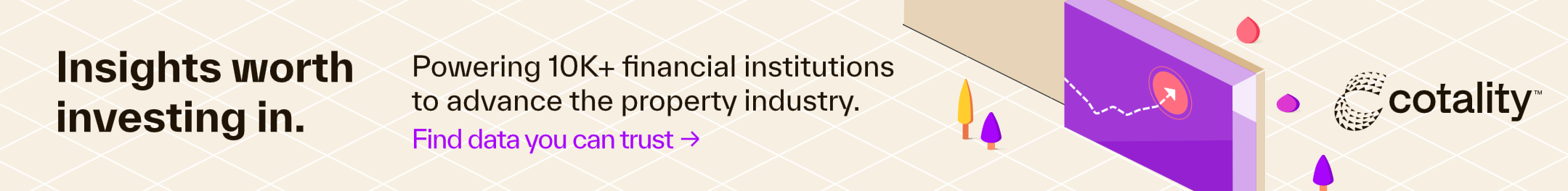
Months later, CoreLogic announced they were rebranding as Cotality. The campaign had performed well for them, and so they came back to refresh the ads in the new Cotality look and feel.
But the Telco division wasn’t the only department who wanted in on the ads. Their teams from residential, financial, retail, government, and higher education also wanted ads of their own.
So after some new exploration, writing, animation, and production, we created a total of 36 new deliverables. An ad for each of the six teams, in three sizes, with two sets of copy.

Okay that’s the end

Capital Southwest
Website: Figma, Rive
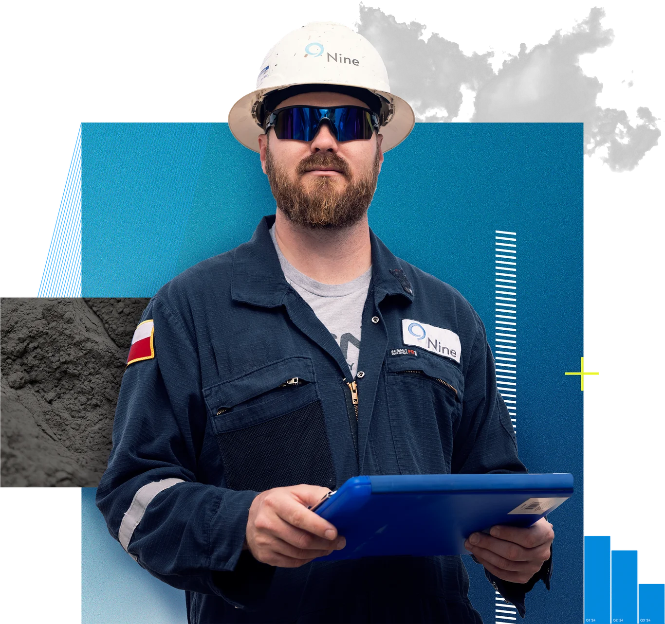
Nine Energy
Website: Figma, Rive, Photoshop
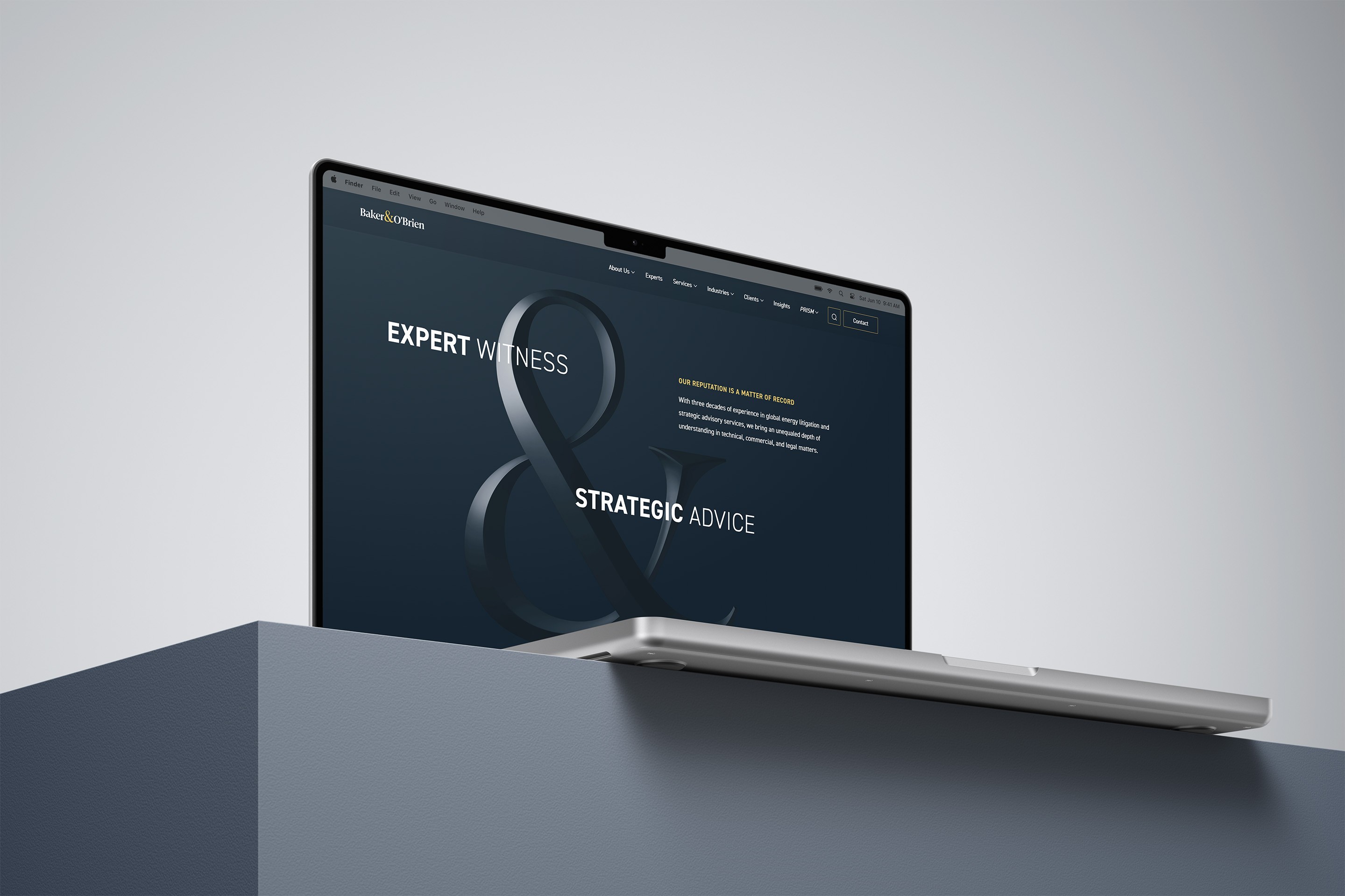
Baker & O’Brien
Multiple disciplines and software

Contact
Uhhh... Oh yea! Call to action!


CoreLogic
Work
About
Contact
The job
CoreLogic approached our team at Pennebaker to develop direct ads that would bring in clients in telecommunications, by highlighting how their location intelligence could be used to guide both marketing and new projects.
The Twist
Our contact at CoreLogic was pretty rusty on targeted digital ads, and our team had recently been experimenting with Rive. What we got was a new way for our designers to create and animate HTML ads.
Concepting


Look Development
Production
Refresh
Results
The setup
CoreLogic’s Location Intelligence supplies broad, detailed property information to help Telcos plan new infrastructure, and better serve their clients.
Think about when they lay new fiber lines or build new cell towers. You need to know an areas flood risk, population density, bandwidth demands, etc. That’s the data that Telcos rely on CoreLogic for.
Concepting

Because it wouldn’t be enough just to make some pretty ads with off-the-cuff headlines, we started with concepting. What would be the consistent theme across every ad.
For me, coming up with concepts is often best done by writing. So I gathered everything I knew about the project, from the buyer personas to my favorite marketing advice, into Figjam, and started writing headlines.
I don’t stop to criticize things for too long. I mostly just try to let one idea spark another, and another. Until I have enough that I can look back and find the common threads.

In the end, there were three ideas that I wanted to share with our team at Pennebaker.
Data You Can Build On
For people who build infrastructure, good data is literally foundational. The idea was that CoreLogics data was so trustworthy, Telcos could use it as a sturdy foundation for new projects.
Prudent People
The three personas were all very similar types of people. So let’s talk about them, instead of ourselves. Focus on the type of people the audience was. The kind of people who don’t leave things up to chance.
Get Real Answers
Finally, the spicy option. This idea was based around how good data allowed you to make predictions about the future. And then contrasting those analytical people with the supernatural ways to know the future.
Look Development
Perhaps it comes easier to other designers, but developing a look and feel for me is usually a more meandering process of trial and error. Luckily I had great advisors in Bryant Ju, Alyssa Oliver, and Katie McKay.
This was also the height of designers trying to figure out how AI might affect our process. So on this project, I used a combination of ChatGPT, reference imagery, and early experiments to iterate into the final look.
Direction 1: Data You Can Build On
Inspired by the idea of our CoreLogic’s audience using this data to plan their projects by getting a view of the data landscape, I wanted to explore using 3D to create small scenes that felt like looking down on dioramas or map boards. Leaning into the brands complimentary color palette, I created scenes for each headline that felt simple, clear, and intentional.
Direction 2: Prudent People
One of the things that the client had mentioned was that their data is both broad and deep. Down to having specific flood histories on individual properties. Combine very technical data with an elevated, analytical feel, and the work of Carl Hauser immediately sprang to mind. I created a quick test render to use as the looks proof of concept to test the clients appetite for tone and whether they would want us to hire a third party like Carl.
Direction 3: Get Real Answers
Knowing that the headlines were on the whimsical side of things, we wanted to look at using their secondary palette that didn’t get much use to bolster a different look for the brand. Essentially, the cool secondary colors would represent the mystical parts of our headline, and end with CoreLogic’s orange; the grounded antidote to the ambiguous superstitions. Illustrations and the final look were created by the pinkest metalhead you’ll ever meet, Alyssa Oliver.
Design and Production
The client decided to hold the spicy option for a future campaign, and use “Data You Can build On” for this initial run. It would also be A/B tested against another direction designed by the absolutely fabulous Bryant Ju.
We went through a couple rounds of edits, and added two more ads to the set. Creating each 3D scene in Cinema 4D, laying them out in Figma, animating them in Rive, and embedding those into HTML files.
I handled most aspects of their creation. But crucially with the help of Hayden Taylor for additional writing, Katie McKay for art direction, and Spenser Hannon for code support integrating the ads with the clients platform.
Designed in Figma | 3D Rendered in C4D | Animated in Rive | Embedded into HTML
Oh, by the way, we’re rebranding”
Months later, CoreLogic announced they were rebranding as Cotality. The campaign had performed well for them, and so they came back to refresh the ads in the new Cotality look and feel.
But the Telco division wasn’t the only department who wanted in on the ads. Their teams from residential, financial, retail, government, and higher education also wanted ads of their own.
So after some new exploration, writing, animation, and production, we created a total of 36 new deliverables. An ad for each of the six teams, in three sizes, with two sets of copy.
Okay that’s the end

Capital Southwest
Website: Figma, Rive
Nine Energy
Website: Figma, Rive, Photoshop
Baker & O’Brien
Multiple disciplines and software
Contact
Uhhh... Oh yea! Call to action!
CoreLogic
Work
About
Contact
The job
CoreLogic approached our team at Pennebaker to develop direct ads that would bring in clients in telecommunications, by highlighting how their location intelligence could be used to guide both marketing and new projects.
The Twist
Our contact at CoreLogic was pretty rusty on targeted digital ads, and our team had recently been experimenting with Rive. What we got was a new way for our designers to create and animate HTML ads.
Concepting
Look Development
Production
Refresh
Results
The setup
CoreLogic’s Location Intelligence supplies broad, detailed property information to help Telcos plan new infrastructure, and better serve their clients.
Think about when they lay new fiber lines or build new cell towers. You need to know an areas flood risk, population density, bandwidth demands, etc. That’s the data that Telcos rely on CoreLogic for.
Concepting

Because it wouldn’t be enough just to make some pretty ads with off-the-cuff headlines, we started with concepting. What would be the consistent theme across every ad.
For me, coming up with concepts is often best done by writing. So I gathered everything I knew about the project, from the buyer personas to my favorite marketing advice, into Figjam, and started writing headlines.
I don’t stop to criticize things for too long. I mostly just try to let one idea spark another, and another. Until I have enough that I can look back and find the common threads.

In the end, there were three ideas that I wanted to share with our team at Pennebaker.
Data You Can Build On
For people who build infrastructure, good data is literally foundational. The idea was that CoreLogics data was so trustworthy, Telcos could use it as a sturdy foundation for new projects.
Prudent People
The three personas were all very similar types of people. So let’s talk about them, instead of ourselves. Focus on the type of people the audience was. The kind of people who don’t leave things up to chance.
Get Real Answers
Finally, the spicy option. This idea was based around how good data allowed you to make predictions about the future. And then contrasting those analytical people with the supernatural ways to know the future.
Look Development
Perhaps it comes easier to other designers, but developing a look and feel for me is usually a more meandering process of trial and error. Luckily I had great advisors in Bryant Ju, Alyssa Oliver, and Katie McKay.
This was also the height of designers trying to figure out how AI might affect our process. So on this project, I used a combination of ChatGPT, reference imagery, and early experiments to iterate into the final look.
Direction 1: Data You Can Build On
Inspired by the idea of our CoreLogic’s audience using this data to plan their projects by getting a view of the data landscape, I wanted to explore using 3D to create small scenes that felt like looking down on dioramas or map boards. Leaning into the brands complimentary color palette, I created scenes for each headline that felt simple, clear, and intentional.
Direction 2: Prudent People
One of the things that the client had mentioned was that their data is both broad and deep. Down to having specific flood histories on individual properties. Combine very technical data with an elevated, analytical feel, and the work of Carl Hauser immediately sprang to mind. I created a quick test render to use as the looks proof of concept to test the clients appetite for tone and whether they would want us to hire a third party like Carl.
Direction 3: Get Real Answers
Knowing that the headlines were on the whimsical side of things, we wanted to look at using their secondary palette that didn’t get much use to bolster a different look for the brand. Essentially, the cool secondary colors would represent the mystical parts of our headline, and end with CoreLogic’s orange; the grounded antidote to the ambiguous superstitions. Illustrations and the final look were created by the pinkest metalhead you’ll ever meet, Alyssa Oliver.
Design and Production
The client decided to hold the spicy option for a future campaign, and use “Data You Can build On” for this initial run. It would also be A/B tested against another direction designed by the absolutely fabulous Bryant Ju.
We went through a couple rounds of edits, and added two more ads to the set. Creating each 3D scene in Cinema 4D, laying them out in Figma, animating them in Rive, and embedding those into HTML files.
I handled most aspects of their creation. But crucially with the help of Hayden Taylor for additional writing, Katie McKay for art direction, and Spenser Hannon for code support integrating the ads with the clients platform.
Designed in Figma | 3D Rendered in C4D | Animated in Rive | Embedded into HTML
Oh, by the way, we’re rebranding”
Months later, CoreLogic announced they were rebranding as Cotality. The campaign had performed well for them, and so they came back to refresh the ads in the new Cotality look and feel.
But the Telco division wasn’t the only department who wanted in on the ads. Their teams from residential, financial, retail, government, and higher education also wanted ads of their own.
So after some new exploration, writing, animation, and production, we created a total of 36 new deliverables. An ad for each of the six teams, in three sizes, with two sets of copy.
Okay that’s the end

Capital Southwest
Website: Figma, Rive
Nine Energy
Website: Figma, Rive, Photoshop
Baker & O’Brien
Multiple disciplines and software
Contact
Uhhh... Oh yea! Call to action!

CoreLogic
Work
About
Contact
The job
CoreLogic approached our team at Pennebaker to develop direct ads that would bring in clients in telecommunications, by highlighting how their location intelligence could be used to guide both marketing and new projects.
The Twist
Our contact at CoreLogic was pretty rusty on targeted digital ads, and our team had recently been experimenting with Rive. What we got was a new way for our designers to create and animate HTML ads.
Concepting


Look Development
Production
Refresh
Results
The setup
CoreLogic’s Location Intelligence supplies broad, detailed property information to help Telcos plan new infrastructure, and better serve their clients.
Think about when they lay new fiber lines or build new cell towers. You need to know an areas flood risk, population density, bandwidth demands, etc. That’s the data that Telcos rely on CoreLogic for.
Concepting

Because it wouldn’t be enough just to make some pretty ads with off-the-cuff headlines, we started with concepting. What would be the consistent theme across every ad.
For me, coming up with concepts is often best done by writing. So I gathered everything I knew about the project, from the buyer personas to my favorite marketing advice, into Figjam, and started writing headlines.
I don’t stop to criticize things for too long. I mostly just try to let one idea spark another, and another. Until I have enough that I can look back and find the common threads.

In the end, there were three ideas that I wanted to share with our team at Pennebaker.
Data You Can Build On
For people who build infrastructure, good data is literally foundational. The idea was that CoreLogics data was so trustworthy, Telcos could use it as a sturdy foundation for new projects.
Prudent People
The three personas were all very similar types of people. So let’s talk about them, instead of ourselves. Focus on the type of people the audience was. The kind of people who don’t leave things up to chance.
Get Real Answers
Finally, the spicy option. This idea was based around how good data allowed you to make predictions about the future. And then contrasting those analytical people with the supernatural ways to know the future.
Look Development
Perhaps it comes easier to other designers, but developing a look and feel for me is usually a more meandering process of trial and error. Luckily I had great advisors in Bryant Ju, Alyssa Oliver, and Katie McKay.
This was also the height of designers trying to figure out how AI might affect our process. So on this project, I used a combination of ChatGPT, reference imagery, and early experiments to iterate into the final look.
Direction 1: Data You Can Build On
Inspired by the idea of our CoreLogic’s audience using this data to plan their projects by getting a view of the data landscape, I wanted to explore using 3D to create small scenes that felt like looking down on dioramas or map boards. Leaning into the brands complimentary color palette, I created scenes for each headline that felt simple, clear, and intentional.
Direction 2: Prudent People
One of the things that the client had mentioned was that their data is both broad and deep. Down to having specific flood histories on individual properties. Combine very technical data with an elevated, analytical feel, and the work of Carl Hauser immediately sprang to mind. I created a quick test render to use as the looks proof of concept to test the clients appetite for tone and whether they would want us to hire a third party like Carl.
Direction 3: Get Real Answers
Knowing that the headlines were on the whimsical side of things, we wanted to look at using their secondary palette that didn’t get much use to bolster a different look for the brand. Essentially, the cool secondary colors would represent the mystical parts of our headline, and end with CoreLogic’s orange; the grounded antidote to the ambiguous superstitions. Illustrations and the final look were created by the pinkest metalhead you’ll ever meet, Alyssa Oliver.
Design and Production
The client decided to hold the spicy option for a future campaign, and use “Data You Can build On” for this initial run. It would also be A/B tested against another direction designed by the absolutely fabulous Bryant Ju.
We went through a couple rounds of edits, and added two more ads to the set. Creating each 3D scene in Cinema 4D, laying them out in Figma, animating them in Rive, and embedding those into HTML files.
I handled most aspects of their creation. But crucially with the help of Hayden Taylor for additional writing, Katie McKay for art direction, and Spenser Hannon for code support integrating the ads with the clients platform.
Designed in Figma | 3D Rendered in C4D | Animated in Rive | Embedded into HTML
Oh, by the way, we’re rebranding”
Months later, CoreLogic announced they were rebranding as Cotality. The campaign had performed well for them, and so they came back to refresh the ads in the new Cotality look and feel.
But the Telco division wasn’t the only department who wanted in on the ads. Their teams from residential, financial, retail, government, and higher education also wanted ads of their own.
So after some new exploration, writing, animation, and production, we created a total of 36 new deliverables. An ad for each of the six teams, in three sizes, with two sets of copy.
Okay that’s the end

Capital Southwest
Website: Figma, Rive
Nine Energy
Website: Figma, Rive, Photoshop
Baker & O’Brien
Multiple disciplines and software
Contact
Uhhh... Oh yea! Call to action!
CoreLogic
Work
About
Contact
The job
CoreLogic approached our team at Pennebaker to develop direct ads that would bring in clients in telecommunications, by highlighting how their location intelligence could be used to guide both marketing and new projects.
The Twist
Our contact at CoreLogic was pretty rusty on targeted digital ads, and our team had recently been experimenting with Rive. What we got was a new way for our designers to create and animate HTML ads.
Concepting


Look Development
Production
Refresh
Results
The setup
CoreLogic’s Location Intelligence supplies broad, detailed property information to help Telcos plan new infrastructure, and better serve their clients.
Think about when they lay new fiber lines or build new cell towers. You need to know an areas flood risk, population density, bandwidth demands, etc. That’s the data that Telcos rely on CoreLogic for.
Concepting

Because it wouldn’t be enough just to make some pretty ads with off-the-cuff headlines, we started with concepting. What would be the consistent theme across every ad.
For me, coming up with concepts is often best done by writing. So I gathered everything I knew about the project, from the buyer personas to my favorite marketing advice, into Figjam, and started writing headlines.
I don’t stop to criticize things for too long. I mostly just try to let one idea spark another, and another. Until I have enough that I can look back and find the common threads.

In the end, there were three ideas that I wanted to share with our team at Pennebaker.
Data You Can Build On
For people who build infrastructure, good data is literally foundational. The idea was that CoreLogics data was so trustworthy, Telcos could use it as a sturdy foundation for new projects.
Prudent People
The three personas were all very similar types of people. So let’s talk about them, instead of ourselves. Focus on the type of people the audience was. The kind of people who don’t leave things up to chance.
Get Real Answers
Finally, the spicy option. This idea was based around how good data allowed you to make predictions about the future. And then contrasting those analytical people with the supernatural ways to know the future.
Look Development
Perhaps it comes easier to other designers, but developing a look and feel for me is usually a more meandering process of trial and error. Luckily I had great advisors in Bryant Ju, Alyssa Oliver, and Katie McKay.
This was also the height of designers trying to figure out how AI might affect our process. So on this project, I used a combination of ChatGPT, reference imagery, and early experiments to iterate into the final look.
Direction 1: Data You Can Build On
Inspired by the idea of our CoreLogic’s audience using this data to plan their projects by getting a view of the data landscape, I wanted to explore using 3D to create small scenes that felt like looking down on dioramas or map boards. Leaning into the brands complimentary color palette, I created scenes for each headline that felt simple, clear, and intentional.
Direction 2: Prudent People
One of the things that the client had mentioned was that their data is both broad and deep. Down to having specific flood histories on individual properties. Combine very technical data with an elevated, analytical feel, and the work of Carl Hauser immediately sprang to mind. I created a quick test render to use as the looks proof of concept to test the clients appetite for tone and whether they would want us to hire a third party like Carl.
Direction 3: Get Real Answers
Knowing that the headlines were on the whimsical side of things, we wanted to look at using their secondary palette that didn’t get much use to bolster a different look for the brand. Essentially, the cool secondary colors would represent the mystical parts of our headline, and end with CoreLogic’s orange; the grounded antidote to the ambiguous superstitions. Illustrations and the final look were created by the pinkest metalhead you’ll ever meet, Alyssa Oliver.
Design and Production
The client decided to hold the spicy option for a future campaign, and use “Data You Can build On” for this initial run. It would also be A/B tested against another direction designed by the absolutely fabulous Bryant Ju.
We went through a couple rounds of edits, and added two more ads to the set. Creating each 3D scene in Cinema 4D, laying them out in Figma, animating them in Rive, and embedding those into HTML files.
I handled most aspects of their creation. But crucially with the help of Hayden Taylor for additional writing, Katie McKay for art direction, and Spenser Hannon for code support integrating the ads with the clients platform.
Designed in Figma | 3D Rendered in C4D | Animated in Rive | Embedded into HTML
Oh, by the way, we’re rebranding”
Months later, CoreLogic announced they were rebranding as Cotality. The campaign had performed well for them, and so they came back to refresh the ads in the new Cotality look and feel.
But the Telco division wasn’t the only department who wanted in on the ads. Their teams from residential, financial, retail, government, and higher education also wanted ads of their own.
So after some new exploration, writing, animation, and production, we created a total of 36 new deliverables. An ad for each of the six teams, in three sizes, with two sets of copy.
Okay that’s the end

Capital Southwest
Website: Figma, Rive
Nine Energy
Website: Figma, Rive, Photoshop
Baker & O’Brien
Multiple disciplines and software
Contact
Uhhh... Oh yea! Call to action!
